Wednesday, February 28, 2018

Every Seashell card for Quick Quotes


Hello Quick Quotes fans, Neva here today to share a card featuring Powder Puff Chalking Inks.  Sometimes you need a “just because” card, and this card is just one of those!


I really liked the saying from the Navigator Quotes and Phrases 500, Every Seashell Has a Story and thought it deserved to be the sentiment for my card.  I continued to build my theme from there.


To create an underwater feel, I used several of the 2018 Powder Puff Chalking Inks.  Starting with the lighter colors and working to the darker colors I inked up an acrylic block.  Purple Rain, Key Largo, Bermuda, Capri Blue, and a very small amount of Deep Sea create to look.  Water color paper trimmed to 5 ¼ x 3 ¾ is spritzed with a small amount of water and then pressed into the ink on the block.  After the paper dried the edges are inked with Deep Sea.


Next I die cut the three seashells and the coordinating overlays from watercolor paper.  The overlays are inked using ink daubers in the darker colors Deep Sea, Kokomo, and Capri Blue.  The seashells are shaded with using ink daubers in the lighter colors Bermuda, Tropical Punch, and Key Largo.  To complete the scene, I tore the edge of another piece of watercolor paper and inked it with Vanilla Cream, Sandy Shore, and the edges with Kokomo.  A slight mist of water directly on the paper is another method to blend the inks.


A section of Navigator 103 is trimmed to 6 ¼ x 4 ¾ and inked with Key Largo.  The sentiment is also inked with Key Largo.  The scene is adhered together with the sentiment lifted with dimensional foam adhesive as is the center shell.  The card seemed to be missing that extra little bit, so Bakers Twine is wrapped around the top section with a triple lopped bow to top it off.  The whole card is put together on a 6 Bar Kraft card base. 

Quick Quotes Products

Other

Watercolor Paper 300 Series Cold Press by Strathmore

Shells Large by Elizabeth Craft Designs

6 Bar Kraft card base by Recollections

Tuesday, February 27, 2018

Happy Birdday for Retro Rubber


Retro Rubber Blog Challenge has a new challenge up, one that is a fun sketch.  I enjoy seeing how everyone interprets a sketch to make it their own.


In my version I created a quick and easy birthday card.


The image from Hero Arts Missing You from 2014 is stamped in StazOn Jet Black.  I scribbled a bit of color on my craft mat in with Memento Dual Tipped Pens in Morocco, Peanut Brittle, and Rich Cocoa.  Using a little bit of water and a small brush the image is water colored.  Using a stamp positioner I stamped in the branch in Rich Cocoa. The sentiment is also stamped in Rich Cocoa.  The image was die cut with Elizabeth Craft Designs 1116 Stitched Circles.  The remainder of my card came from my paper scrap bin.  All the paper pieces are edged in Rich Cocoa to finish the look.   I believe the patterned paper is My Minds Eye.  The card is assembled on an A2 card base and is ready to mail.

I do hope you will play along with this latest challenge.  We have a great deal of fun over at Retro Rubber!  Remember to use at least one image that is older than a year, tell us how long you have had it, and to enter up to 10 challenges including ours!

Monday, February 19, 2018

Awesome Day for Quick Quotes


Hello, Neva here today to share with you an outdoor layout using Quick Quotes Spring Showers Collection. 


I have boys . . . which means I don’t often get to scrapbook using flowers.  But with this set of outdoor photos that included a flower I couldn’t resist using the flower inspired Spring Showers collection to create a brightly colored layout.


The left side of the layout features Spring Showers 100 with mats from Spring Showers 101 and 103. The section hidden behind the photo block on the right side of the layout provided the journal block and die cut; it is the reverse side of Spring Showers 103.  The journal block is inked with Bermuda as is the journal section which is from behind the photo on the left side.    


I wanted to highlight the large focal photo with a dramatic frame. First the photo is matted with Spring Showers 101 that is inked with Tropical Punch.   However, I didn’t have a punch that matched the style I wanted to create, or a die cut large enough to surround the photo.  This die is designed for a 5” x 7” card, but I trimmed it into four sections to mat each of the four corners of the photo.  An easy trick to enlarge any of your die cuts to your desired size don't you think?


The title is die cut and then matted on vellum.  Initially the title was getting lost in the beautiful flowers of the patterned paper.  I inked the back of the vellum with Tropical Punch to lift it out of the background. 


The right side has all the photos matted on a section of Spring Showers 103 which is inked with Capri Blue.  Behind the scenes I cut the center of the paper out to use on the left side as mentioned above.  Don't want to waste any pretty paper!


The journal strips are from Earth Wind Fire 500, cut into sections and inked with Bermuda.  Then to match the companion side, the strips are matted with Spring Showers 101 and inked with Tropical Punch.  Even though they are from a different collection I think they match nicely and add just the right touch to this nature based inspired layout.

Quick Quotes Products
Spring Showers collection (Coming Soon)
PowderPuff Chalking Inks Tropical Punch, Capri Blue, Bermuda

Other Products
Mystical Embrace die by Spellbinders
Emily alpha by Quickutz

Try using flower printed paper with your outdoor layouts, whether they are for boys or not!  You might be surprised how much you like the end product!
--Neva

Tuesday, February 13, 2018

Get Dotty with Retro Rubber


It is time for a new challenge at Retro Rubber ChallengeBlog.  This time around use dots or circles in your creation!


Just remember to use at least one stamp that is older than a year, let us know how long you have had it in your stash, and enter up to 10 challenges along with ours!


My take on the challenge used an old Technique Tuesday stamp set that had three sizes of dots.  It is from 2005 and is called Love Me, Love me not.  I experimented with two different Kaleidacolor ink pads and decided that the Spectrum version was the winner.  Happy Birthday Sizzix Framelits Drop-Ins was die cut and then the front of the card base was brayered with the Spectrum Kaleidacolor.  The dots were stamped randomly on the Happy Birthday die cut, and the inside of the base card where it shows behind the sentiment.  A second die cut of Happy Birthday is trimmed to add some dimension by adhering with dimensional foam adhesive above random letters.  What a fun colorful card to send to some lucky birthday person!

Thanks for stopping by and do go check out all the other lovely examples by the Retro Rubber Design Team.  We had a blast with this challenge.

Thursday, February 8, 2018

Love Challenge for Quick Quotes


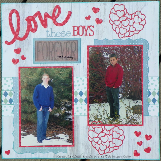
Quick Quotes has a very seasonal challenge for you, the theme is Love, perfect for February!  Neva, here to share my take on the challenge.  I had some fantastic photos from last year’s Christmas photo shot that I wanted to scrap, my two boys.  The lighting was perfect, we had a little snow on the ground, and for a change the boys were cooperative!   


I love the B side of many of the papers Quick Quotes manufactures, and Spring Showers is no exception.  I started with Spring Showers 102, as the white-washed wood background was a perfect base for the photos.  To add a splash of color I used Spring Showers 104 to create mats and die cut the accents.  The B side of Spring Showers 100 is a calm blue and is used to create shaped mats for the photos with a border and corner punch set.  The final accent is Spring Showers 103, using both sides to create a patterned strip across the page. 


A few details from the layout, first here is the behind the scenes look at my matted photos.  Because I like to use many layers of paper on my layouts my albums tend to get really heavy.  To avoid extra weight, I trim away parts behind the photos that don’t show, and as a bonus I have pretty paper to create die cuts, companion pages, journal cards, or greeting cards at a later date.


Forever and a day, K75 vellum strip provided part of the title.  I carefully trimmed the section and inked the back with Tropical Punch before backing it with a trimmed section of Spring Showers 100.


A close up the background strip and the shaped mat for the photos shows how Burmuda and Key Largo PowderPuff Chalking inks adds just a little bit of extra dimension to the layout.


The pattern in Spring Showers 104 is so subtle in the heart die cut.  I also edged the entire page in Burmuda. 

I am very pleased with the final look of the layout.  The photos are highlighted with just the right combination of colors from the Spring Showers collection.

Quick Quotes Products
Spring Showers (Coming Soon)
PowderPuff Chalking Inks:  Bermuda, Key Largo, and Tropical Punch

Other Products

Heart die from Impression Obsession DIL056-J

Love die from Momenta

Boys Rule die from Echo Park

CK Typist font from Quickutz

Cherish corner and border punch from Martha Stewart

Thank for stopping by the blog today, it is a joy to share with you a page about loving my boys!  

Neva


Monday, February 5, 2018

Full of Wonder for SID Double Page Team

A few days ago I spent some wonderful time crafting away in my craft cave.  A little flu kept me from fully enjoying time out with my family, but I made the best of things!

I worked with the February sketch for SID:


Additional inspiration came from our collaboration with Scrap the boys:


I really had fun creating this layout for my younger son.  He often goes along on family outings that are centered around his older siblings.  This trip was no exception, but while we were there, Peter and I had a great time playing around the shores of Lake Dillon while his dad and brother were busy sailing in a regatta.


I started with the basic light blue cardstock for the background and scored lines to create the spots for each of the 2 3/4" squares of patterned paper.  I pulled out my scrap bin, the one where I keep all the scraps from previous layouts together and plastic bags.  My primary purpose for this bin is for card making, so all the coordinating scraps stay together.  But for this layout I went looking for the light blues and greens and cut squares from the scraps that were big enough.  I a few cases the ones not quite the right size or missing a corner were placed under the photos.  Knowing that putting a rub-on across several different thicknesses would likely not go well, I placed the Daisy D's rub-on onto a sheet of vellum.  Then it was also easily cut in half to span the two sides.  To follow through on that theme, I printed the journaling on vellum and dried it with a heat gun.  The journaling was cut into strips and all of the vellum was adhered using Xyron adhesive that doesn't show through.  The finishing touches are a few bits of wood veneer from Studio Calico.  I am really pleased with the finished layout and so glad to have it done for Peter's album!


Sunday, February 4, 2018

A Picnic with Peter layout


Last weekend Stick It Down sponsored a crop on Facebook, what great fun we had.  We hope to do it again in a few months.  I found that it really helped me focus on getting a bit more scrapbooking done, and jump started my creative joy.  In this day and age, it is not as easy to carve out time to go to a scrapbooking retreat . . . but I missed the camaraderie of scrapping with others.  Que the online crop! 

 
This is from the blind challenge, we were given a series of written instructions without seeing the sketch.  Most completed something very similar to this layout.  I used the two different sides of Quick Quotes Earth Wind Fire 110 for my patterned paper selections.  Matching cardstock from my stash is used for the die cut circles and to mat the photos.  Earth Wind Fire 500 and 600 phrases provided the coordinated sentiments and journal card.  PowederPuff Chalking inks in Deep Sea and Cactus add extra depth to the layout as well as coloring the P monogram by Basic Grey.  Ribbon and brads from my stash are the finishing touch to this fun layout.  Spellbinders Grand Circles and Grand Scalloped Circles were used for the die cuts.  The alpha font is Frankie mini by Quickutz.  The journaling is done in Zig Navy. 

Thanks so much for stopping by, I hope you had fun watching the Super Bowl commercials today!