Showing posts with label Digital Die Cuts. Show all posts

Tuesday, July 19, 2022

Create Your Own Perfectly Matching Background Paper!


In today's tutorial I will show you how to create a background paper that will allow your photo(s) to shine on a scrapbook layout.  Using Memento Inks that match the photo allows the photo to be the center star of the layout.  All the embellishments will also match by coloring with the same inks.  The background itself is super quick and simple, and can be used for cards as well as layouts.

Skill:  Beginner

Time:  1 hours

 Directions:

Step 1:


Select ink colors that are in the photo you wish to highlight.  In my case it is one of my favorite photos from our travels to Oahu when we climbed to the top of Koko Head.  The stunning blue, brown, and green directed my choice of ink colors.  In this step Memento in Peanut Brittle is brayered randomly over a sheet of canvas textured white cardstock.  Cover about a third of the cardstock in varying levels of ink layers.  The key to this technique is to not look for perfection, just go for a fun look!

Step 2:


Memento Bahama Blue is used to ink the next layer in the background.  A good quality rubber balloon is filled with popcorn and tied off.  This is used to ink with random size dots in varying ink intensities on the background covering about one more third of the paper.

Step 3:

A second balloon filled with rice gives a slightly different ink look for the last layer using Memento Olive Grove.  Fill in the remaining open areas on the cardstock to finish the background.

Step 4:


The embellishments are shown here as one step, as the main focus of this tutorial is the background technique.  Smooth texture cardstock is used for all the embellishments as it die cuts more cleanly.  A frame of white cardstock is trimmed to 7 1/2 " x 5 1/2 " and inked with Memento Luxe in Peanut Brittle.  The Luxe ink blends a little more easily over larger areas.  The title is die cut in triplicate, then adhered together with small dots of OnPoint Glue around the die cuts to add dimension, and finally inked with Memento in Danube Blue.  A die cut of the island of Oahu is inked in Memento Olive Grove.  

Step 5:


When the photo was layered over the frame the match between the soil and the Peanut Brittle was so close, they blended together!  The edges of the photo are inked with StazOn in Jet Black to add definition to all edges of the photo, and allow the photo to stand out from the frame.

Step 6:

A journal block is written on the computer and printed out using photo settings and trimmed to size.  A frame is trimmed 1/4" larger than the journal block and inked in Memento Danube Blue.  The two are adhered together with Tear It! Tape.

Step 7:

 
The elements of the layout are placed on the background and adhered with Tear It! Tape or OnPoint Glue.  Memento Dual Tip Marker in Tuxedo Black is used to mark a small "X" as to the location of Koko Head on the Island of Oahu.   

Art Supplies

Imagine:

Memento--Peanut Brittle, Danube Blue, Olive Grove

Memento Luxe-- Peanut Brittle

StazOn--Jet Black

Memento Dual Tip Maker--Tuxedo Black

Ink Daubers

Tear It! Tape

On Point Glue

Other:

White canvas textured cardstock

White smooth textured cardstock

2" Rubber Brayer

Rubber balloons with popcorn and rice

Momenta Casual Script Alphabet Dies

Die Cut machine

Brother Scan and Cut 

Silhouette Design Store--Hawaii State die cut modified, Candy Apple Bold Script

Tuesday, April 12, 2022

Sketchy Time at Retro Rubber Easter Card

 It is time for a new challenge over at Retro Rubber Challenge Blog.  This is a beautiful clean and simple sketch that can be adapted in many ways.

Since Easter is coming up I choose a very classic scene for this sketch using Joy Clair's My Redeemer from March 2017.  

  • I do not have a sunburst stencil or die in my stash (gasp!), so I found one as a card design at the Silhouette Design Store and made my own from 60 lb Bristol Board vellum finish.
  • Using my DIY stencil I blended Memento Dandelion, Cantaloupe, and Tangelo to create a background.  
  • The cross is stamped in the center and on another section of cardstock in VersaFine Onyx Black and heat embossed with iridescent embossing powder.  After tapping VersaFine Crimson Red and Vintage Sepia I used a spritz of Ink Potion No. 9 and a fine paint brush to color both crosses.  The second cross is fussy cut with scissors.
  • In my stash of ancient Provo Craft Slabs I found the perfect multi-colored paper to finish the sketch.  A 4" strip was cut and then Lawn Fawn Cuts Stitched Hillside Borders to die cut the two different shades from the paper.  They were purposefully cut a little long so I could overlap the edges in a way that fit the sketch.  After they were adhered I trimmed the excess with scissors.
  • The fussy cut cross was added with dimensional foam adhesive.
  • Taylored Expressions Simple Strips Easter from February 2021 added the sentiment.  It is stamped in VersaFine Onyx Black and heat embossed with iridescent embossing powder.  Memento Cantaloupe is inked over the sentiment that was die cut with the matching die.  A backer die cut was added to finished the sentiment then adhered with dimensional foam adhesive.
A CAS Easter Card, I plan on making a few more as I still have plenty of the multi colored paper to make contrasting hills!  Please do come join us at Retro Rubber Challenge blog and have a little fun creating with the sketch!  

CHALLENGE GUIDELINES

  • We require stamps older than one year.  If we feel you are using newer stamps, you may be disqualified from the challenge without notification.
  • New papers/dies are OK – but you must use at least one stamp older than a year and describe the age in your blog post.
  • Please note that all challenges require the use of at least one stamp older than a year.
  • Post your new creation to your blog or online gallery.   Use keyword RRCB180.  No backlinking. 
  • Link back to the blog using the Linky Tools by the due date. 
  • Enter as many times as you like. 
  • Feel free to combine our challenge with a maximum of 10 challenges.  Entries linked to more than 10 challenges will be disqualified without notification.
  • If your project is posted on a private group site such as Split Coast Stampers or a photo sharing site not all DT members may be able to comment.   Thank you for understanding.
  • Turn off Word Verification.  We love to comment but word verification can make that difficult.

Friday, March 18, 2022

Pastel Easter Card Made Easy with Kaleidacolor


See how to use the Kaleidacolor ink pad to create a pastel Easter Card with subtle style that can be completed in a short amount of time.  Layering with contrasting cardstock and texture added with embossing folders gives this card great dimension. 

Skill:  Beginner

Time: 30 minutes

Directions:

 
Step 1

Trim white cardstock to 8.5" x 5.5" to make card base.  Fold in half and use a rubber brayer to ink the front of the card with Kaleidacolor in Baby Powder.  Move the brayer to fully cover the card and re-ink brayer as needed to create a well inked surface.  Pay attention to direction of ink pad and brayer to avoid mixing the ink colors beyond the ombre look.

Step 2

Trace the outside of a cross die on craft cardstock to create a matching layering piece.  Fussy cut the layer three time or use a electronic die cut machine to cut three layers.  Glue the layers together with OnPoint Glue.  Using a wet glue allows a little time to wiggle the layers into perfect position. 


 Step 3

Place die on white cardstock and die cut and pressure emboss with rubber mat.  Use a make-up sponge rolled to pick up ink in the same ombre of the Kaleidacolor ink pad and ink through the die onto the raised embossed areas.  Die cut two more layers and glue the colored die cut to the top of the first two white layers.  


Step 4

Ink the raised portion of the embossing folder with Kaleidacolor Baby Powder in the same color direction as the card base.  Pressure emboss a 3.75" x 5" section of white cardstock.  The ink will transfer to the indentations of the design.


 Step 5

Trim a section of Kraft cardstock to 4" x 5.25".  Layer the assembled parts of the card without adhering them together to determine the placement of the sentiment.  I choose the appropriate size circle die to die cut the corner of the pressure embossed white cardstock.


Step 6

Using the next size smaller circle die and pressure embossed white cardstock to determine placement of the smaller circle die on the Kraft cardstock and die cut. 


Step 7

Determine placement of sentiment and remove the layers.


Step 8

Stamp the sentiment in Delicata Sapphire Blue.

Step 9

Adhere the layers of the card together.  The Kraft cardstock layer is adhered with dimensional foam adhesive.  All the other layers used Tear It! Tape for best adhesion.

Art Supplies

Imagine

  • Kaleidacolor--Baby Powder
  • Delicata Sapphire Blue
  • OnPoint Glue
  • Tear It! Tape

Other

  • Brayer
  • Spellbinders Crosses Two, Standard Circles Large and Small
  • Darice Crosses Embossing Folder
  • Scan n Cut
  • Taylored Expressions Inside Scoop Easter Blessings
  • Dimensional Foam Adhesive
  • Make-up sponge

Friday, September 10, 2021

Fall leaves Thanks for Imagine


In today's card making tutorial I will show you how to create fall themed Thanks card using three different inks from Imagine.  The autumn colors are vibrant and blend well with kraft card stock and burlap ribbon.  I hope this card inspires you to think of all things pumpkin spice and apple cider as we head into fall!

Skill:  Intermediate

Time:  1.5  hours 

Directions:


Step 1

Spritz white cardstock with Fireworks! Lady Bug, Tangelo, and Dandelion.  I like to start with the darkest color first working to the lighter color to fill in the last areas of white.  Set aside to dry. 


Step 2

Use Memento Peanut Brittle and Ricch Cocoa to ink white cardstock.  I used the ink pad directly on the cardstock as I wanted a splotchy look.


Step 3

Die cut the Fireworks! colored cardstock with Skeleton Leaves dies.  Cut an outline to back the skeleton leaves either by hand or with an electronic die cutting machine.  Adhere the layers together with On Point Glue.  Small dots in the thicker areas of the leaves works best.


Step 4

Die cut one “Thanks” sentiment from the Fireworks! colored cardstock and three from white cardstock.  Layer together with On Point Glue to create a dimensional sentiment.  To avoid glue from leaking out from between the layers use small dots of glue on the outside edges.


Step 5

Use a soft rubber brayer to ink cardstock trimmed to 4.74” x 5.75”.  Kaleidacolor in Autumn Leaves was used with the green portion in the middle and the light orange on either end of the cardstock.  Flip the cardstock to achieve this look.


Step 6

Pressure emboss the cardstock with Basket Weave embossing folder.  Use a sanding block to remove color and allow the embossed design to pop.


Step 7

Adhere background to A7 kraft card base with Tear It! Tape.  Adhere burlap ribbon with Tear It! Tape, it is translucent enough that it does not show through the burlap, and will hold the card together.  Adhere Thanks sentiment with On Point Glue.  Adhere the leaves with Tear It! Tape.


Art Supplies


Imagine


·      Fireworks!—Lady Bug, Tangelo, Dandelion

·      Memento—Peanut Brittle, Rich Cocoa

·      Kaleidacolor—Autumn Leaves

·      On Point Glue

·      Tear It! tape


Other

·      Sizzix Thinlets Skeleton Leaves

·      Spellbinders Phrase Set One

·      Darice Basket Weave embossing folder A7 size

·      Recollections A7 card Base

·      Burlap Ribbon

·      Sanding Block

·      Dimensional Foam Adhesive

·      Brother Scan-N-Cut


Thanks for stopping by!

Friday, February 5, 2021

New Techniques for Embossing Stunning Cards for Imagine

In today’s crafting tutorial I will show you how to use various Imagine products to create a sparkly stunning spring time Birthday Card.  It will feature both Mboss Valentine, Versa Mark Ink, and Embossing Powders.  The tutorial will also show you how you can use Versa Mark over other inks to create a cohesive embossed look for a card, even if you do not have embossing powders in additional colors. 


Skill:  Intermediate

Time:  45 minutes


1.     Trim card front to 4.75” x 6.25” to fit a standard A-7 card base.  It is important to use a stamp positioner platform for this technique to ensure that the image lines up properly on the finished card front.


2.     Color stamen portion of Penny Black First Waltz Tulip with Versa Marker and heat emboss with Black embossing powder.  Pro tip: use a dry fine tip paint bush to remove any embossing powder that ends up on the card you do not want to emboss before heating. 


3.     Use the Versa Mark small cube which allows you more precision in where you place the Versa Mark ink to ink the flower portion of the image.  Cover with Mboss Valentine, and carefully remove powder from the stamen area with a dry fine tip paint brush then heat emboss.


4.     Color directly on the stem portion of the image with Memento Dual Marker in Pear Tart and Bamboo leaves.   Mist stamp lightly with water before stamping as this reactivates the ink to create a crisp image.


5.     Clean leaf portion of the image and ink with Versa Mark ink.  Stamp over the previously colored and stamped image with Versa Mark Ink and heat emboss with Iridescent embossing power.


6.     Stamp the Celebrate sentiment in Versa Mark Ink and heat emboss with Mboss in Valentine.  Die cut the sentiment, I used my Brother Scan N Cut.


7.     I also stamped the inside of the card, as I intend to send it to a special friend for her birthday.  Stamp the sentiment in Versa Mark Ink and heat emboss with Mboss in Valentine.


8.     Lightly ink the card base and card front with the Memento Luxe Pear Tart ink pad to add just a hint of green around both layers.  I ran the ink pad around the edges of the cardstock to create a light tint.


9.     Apply Tear It tape to back of the card front and adhere to the card base.


10.  Adhere the Celebrate sentiment to the card front using adhesive foam tape.


Art Supplies


Imagine

·      Versa Mark Ink

·      Versa Marker

·      Mboss - Valentine

·      Memento Dual Marker - Pear Tart, Bamboo Leaves

·      Embossing Powder - Black, Iridescent

·      Memento Luxe - Pear Tart

·      Tear It! Tape

    0.5 fl oz spray bottle


Other

·      Penny Black - First Waltz

·      Kelly Creates - Traceable Celebration Stamps

·      Brother Scan N Cut

·      Stamp positioner

    Fine tip paint brush

Thanks so much for stopping by, know that I always appreciate your comments.  It is super fun to be back with Imagine as a Guest Designer!

Monday, May 4, 2020

Stick It Down Double Page Drill Team Reunion

Hello all!  A few months back I attended an All Class Reunion for my High School located in Kodiak, Alaska.  We had four members from our junior year that were all on Drill Team Together.  These photos were perfect for this month's sketch from Stick It Down!


I choose to use school colors of Blue and Gold to scrapbook the page and add embellishments that represented our High School and mascot, the Kodiak Bear!


  • The base cardstock is two toned, so the die cuts and journal strips are the reverse of the base cardstock trimmed from behind the patterned paper.
  • Core'dinations Yellow Small Dots, and Dark Blue large dots, Darice Yellow Stripes and Dark Blue Plaid, along with some ancient Provocraft Slab II Yellow Plaid are used to create the sketch.
  • Blue ribbon from my stash adds the final background section.
  • The Bear is did cut from a file from the Silhouette Store.
  • The KHS emblem is designed from the Varsity font also from the Silhouette Store.
  • The title is die cut with a font on my Scan N Cut.
I am so pleased that I had so many patterns to work with on this sketch, why don't you give it a try and join us at Stick It Down! this month!

Friday, April 17, 2020

Guest Designer for Single Page at Stick It Down

I am excited to give a single page layout a sketch with our team over at Stick It Down.  I had just two photos printed from an event and decided this would be a great way to showcase them since a long title was perfect for the layout.


My version is from a fall event, and the colors are very vibrant for the season.


  • The Quick Quotes Autumn Brilliance Collection was perfect, I used I used two sides of one paper and one side of two more of the collection.
  • A Plaid ruler for tearing paper made quick work of tearing the edges.
  • During the quarantine I am learning how to use my Brother ScanNCut and Canvas Studio.  It was easy to create my own wavy edged circle frames.
  • The title font is a Silhouette font, ZP Whiplash.  
I hope you enjoy my interpretation of the single page sketch!  So come a play along with us over at Stick It Down!

Monday, April 6, 2020

April SID sketch, State Wrestling

How much our everyday life has changed in the last few weeks.  I pray that you and your loved ones are safe and healthy as we weather this pandemic together.  We over at Stick It Down will continue to provide inspiration with our monthly sketches for cards, single page layouts, and double page layouts.  April's double page layout features a large photo.


My choice was to use a photo I purchased from the professional photographers at my older son's state tournament appearance.  I also went for a really BIG title.  I am happy to report that my son was pleased with the layout.


  • I have a collection of wrestling related papers from Stamping Station AKA Scrapbook Customs.  If you have need for a particular sport this is a great place to purchase theme related papers.
  • I keep the cardstock simple and used school colors of red, black and white.  
  • The smaller team photo is backed with Darice Large Black Dot.  The photo was taken from a distance on a balcony above the event center main floor.  I am still pleased that I captured this moment.
  • The wrestlers and singlet cut files are purchased on Esty from PenAndPosh
  • The white script is from Silhouette Sweet Tea font and the red is a font on my Brother ScanNCut.  
During this time we are all dealing with a myriad of emotions depending on our situation.  For me and my family I am at home on 6 acres with my husband, two sons, and four German Shepherds.  We have plenty of chores and activities to keep us sane and happy.  My husband is able to work from home, but as a substitute teacher my services are not required.  I am the family errand runner, so am taking great care to stay safe and clean! 

Do take some time to be crafty!  For many of us it is an escape and therapy!


Wednesday, March 11, 2020

No River Required

I often create layouts in duplicate or triplicate for my kids' albums.  This was the case for this layout, three kids with memories to preserve, so three layouts. 


I found several patterned papers I wanted to use that were great colors for the photos, but I only had one sheet of each.  So the challenge was to create a layout that would use one third each.  I think I accomplished my goal! 

Several years ago I purged all my printed magazines as they were taking up room on my shelves and not being used.  Before I did that though, I salvaged articles and ideas for layouts that appealed to me.  This layout is based on an article from Creating Keepsakes Nov/Dec 2010, about using scraps. 

  • My Minds Eye Lime Twirl collection stripes and darker blue patterned paper, and Creative Imaginations Blue Scroll were used.  Bottom rectangles are 2" x 3".  
  • Top strip is 1" backed by 1 1/2" white cardstock.
  • Four punches were used to created the different size circle.  The punches are fast, compared to die cutting!  EK Succes, Fiskars, Marvy and McGill are all represented.
  • Bazzill green is the background, Darice Persimmon is the orange.
  • The journal strips are inked in Memento Danube Blue and written in Zig Writer Navy.  
  • The title was cut on my Brother Scan N Cut.  
A bit time consuming to create three of the same, but I am very pleased with the results.  Thanks so much for you comments and time to stop by!

Monday, March 9, 2020

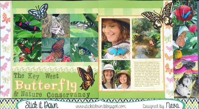
Butterflies for SID March Double Page Reveal

Even though my photos were taken last fall (in Florida) they are perfect for a spring green layout.  We have several fun sketches for you over at Stick It Down.  Not only a double page, but also a single page, and card sketch to play along with for the month.  Check it out!


For my layout I choose to add more photos, by making them smaller.  There are too many wonderful things to share from this experience at The Key West Butterfly and Nature Conservancy.  (At least I had the long title!)


I tried several different colors of background cardstock before I finally decided on the green.  With the bright colors of the butterflies and fun patterned paper I think it holds the layout together.
  • A very old collection by Me & My Big Ideas by Ellen Krans (2006) had all the selections of coordinated paper to make it easy to put together.  
  • Paper Studio light yellow washi adds a dash of pastel to the eges of the butterfly paper.
  • I love butterflies, and sometimes (well often!) will buy a stamp or die just because it is a butterfly.  The Cuttlebug Anna Griffin Butterfly Trio was just such a purchase.  Look how wonderful they are as embellishments for this layout.  If you look closely some of the highlights are colored through the die with Writer Chalk Collection markers.  I also backed each butterfly with a matching die cut by scanning on my Brother Scan N Cut and die cutting coordinating cardstock to put behind the butterflies.
  • Another butterfly tool in my stash is the Tonic Butterfly border punch.  I just had to use it in this layout as an add on embellishment.  The top edge is punched with EK Bubble edge border punch.   
  • The title is a combination of Stampabilities Vintage Type alpha stamped in Tuxedo Black Memento Luxe and Quickutz Tangerine & Shadow.
  • The yellow and orange dot patterned paper is backed with orange cardstock, and the journaling is printed on yellow cardstock that is the exact color of the patterned paper.
Do come and check out the blog and give one of our sketches at Stick It Down a try.  It will be fun!

Thanks for stopping by your comments always make me smile!