Showing posts with label multi photo. Show all posts

Thursday, June 23, 2022

Fourth of July Layout Made Easy with Memento inks and Fireworks!

Today I will share how easy it is to create a very cohesive layout using just two ink colors and the matching Fireworks! colors for an amazing Fourth of July scrapbook layout.  With just white cardstock, an embossing folder, a large die cut, and stamps this layout is perfect for Independence Day.

Skill:  Beginner

Time:  2 hours

 Directions:

Step 1:


Trim white cardstock to 1" on each edge larger than the photos.  Pressure emboss with Star Blanket.  Ink raised portion of embossed areas and edges with Memento Danube Blue or Lady Bug.  For my layout I trimmed two sections 5" x 7", three sections 4" x 5", and one section by 4" x 4" to back my phtotos.

Step 2:


Die cut two sets from Spellbinders Cascading Stars die and remove the stars.  Trim one outline die cut into a section of five stars, with the other being four stars.  Use Jumbo Dauber to tap Memento Danube Blue over one die cut and the smaller portion of the trimmed die cut.  Tapping the ink onto the paper keeps from damaging the die cut, which can occur if a rubbing motion is used.  The larger portion of the trimmed die cut is inked in Memento Lady Bug.  Continue to add ink until it is the desired hue. 

Step 3:


The splatter method is used with Fireworks! to add some interest to the white background.  Shake the bottle to distribute glimmer and then remove spritzer nozzle and gently tap the top to splatter ink from the outside of the spray tube.  Continue to tap until the desired amount of ink is on the paper.  I choose sections where the die cuts would be eventually placed.  I alternated the color choices from the die cut color.  This is the lower right corner of the right page.  

Step 4:


The left side of the layout shown completed with splattered Fireworks! in Memento Lady Bug and Danube Blue.

Step 5:


Determine placement placement of elements to add stamped sentiments.  Place on layout and remove other elements.  Use a stamp platform to stamp sentiments in proper position.

Step 6:

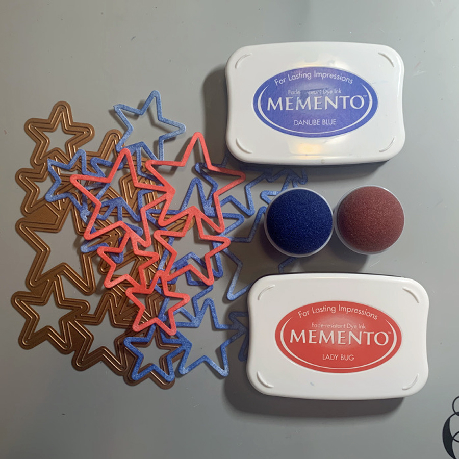
On the right page the stamped elements are determined, then half are removed before stamping to allow for clean stamping of correct colors.  The remaining elements are added and stamped.  It was easier to stamp all the images Memento Lady Bug at one time, then follow with images in Memento Danube Blue.

Step 7:


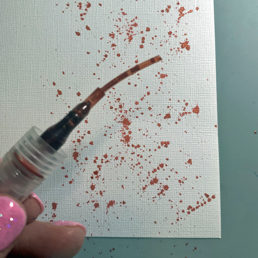
Spritz Fireworks! into a plastic tray or surface.  Place die cut stars from step 2 face down on the Fireworks! ink to add color.  Use tweezers to move around in the ink and add more ink to tray as needed.  About a third of the stars were inked with Fireworks! in Lady Bug the remaining in Fireworks! Danube Blue.

Step 8:


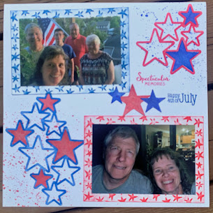
Determine correct placement of Fireworks! stars in the die cut.  I rotated the star until it fit properly into the die cut area.  Not all the stars are identical, so taking the time to find the right one was worth the effort for a seamless look.   

Step 9:

Adhere elements to layout.  Tear It! tape was used to adhere the photos to the textured mats.  The die cuts are adhered with On Point! glue.  The small dots around the star frames keep the layout clean and smudge free.  


Art Supplies

Imagine:

Memento--Lady Bug and Danube Blue

Fireworks!--Lady Bug and Danube Blue

Jumbo Dauber

Tear It! Tape

On Point Glue

Other:

White Cardstock

Cuttlebug Star Blanket embossing folder

Spellbinders Cascading Stars

Technique Tuesday Spectacular Memories

Hero Arts CL493 Holiday Sentiments

Tweezers

Die Cut machine

Stamp Platform

Thursday, March 12, 2020

NW Duals

Wrestling is a sport that I have thousands of photos . . . when the boys were younger I could distill a season down into a layout or two.  For John's senior season I decided to scrap each event in it's own layout.  Even with that I must select down to a few photos of some very intense minutes. 


Mountain View colors are red and black, so an easy choice to stay in that color scheme.  I ordered a batch of Darice papers as I knew with three kids to go through Mountain View I would use them frequently for sports and school events.  
  • Each photo is backed with Bazzill red cardstock and the background is Bazzill black cardstock. 
  • Three patterns of Darice papers are used:  Large Black Dots, Red Plaid, and Red Stripe
  • Since I wanted to layer the patterned papers a frame of grey cardstock helped define and separate the two. 
  • The red stripe is punched with the Paper Studio Pennant punch.
  • Paper Studio Wrestling stickers are backed with the grey cardstock and fussy cut.  They blended into the background too much otherwise.  
  • The title font is Recollections, and stood out much better on the red plaid than on the black back ground.  
  • Journaling was also printed out on the grey cardstock.  
I am happy to have another layout completed.  Sometimes not doing all the wrestling layouts at the same time helps my creativity.  Thanks for stopping by, and know that your comments are always appreciated!  

Monday, March 9, 2020

Butterflies for SID March Double Page Reveal

Even though my photos were taken last fall (in Florida) they are perfect for a spring green layout.  We have several fun sketches for you over at Stick It Down.  Not only a double page, but also a single page, and card sketch to play along with for the month.  Check it out!


For my layout I choose to add more photos, by making them smaller.  There are too many wonderful things to share from this experience at The Key West Butterfly and Nature Conservancy.  (At least I had the long title!)


I tried several different colors of background cardstock before I finally decided on the green.  With the bright colors of the butterflies and fun patterned paper I think it holds the layout together.
  • A very old collection by Me & My Big Ideas by Ellen Krans (2006) had all the selections of coordinated paper to make it easy to put together.  
  • Paper Studio light yellow washi adds a dash of pastel to the eges of the butterfly paper.
  • I love butterflies, and sometimes (well often!) will buy a stamp or die just because it is a butterfly.  The Cuttlebug Anna Griffin Butterfly Trio was just such a purchase.  Look how wonderful they are as embellishments for this layout.  If you look closely some of the highlights are colored through the die with Writer Chalk Collection markers.  I also backed each butterfly with a matching die cut by scanning on my Brother Scan N Cut and die cutting coordinating cardstock to put behind the butterflies.
  • Another butterfly tool in my stash is the Tonic Butterfly border punch.  I just had to use it in this layout as an add on embellishment.  The top edge is punched with EK Bubble edge border punch.   
  • The title is a combination of Stampabilities Vintage Type alpha stamped in Tuxedo Black Memento Luxe and Quickutz Tangerine & Shadow.
  • The yellow and orange dot patterned paper is backed with orange cardstock, and the journaling is printed on yellow cardstock that is the exact color of the patterned paper.
Do come and check out the blog and give one of our sketches at Stick It Down a try.  It will be fun!

Thanks for stopping by your comments always make me smile!

Wednesday, January 29, 2020

Blankies Layout

Hello all, I am finally having some time to do some scrap layouts.  Not usually a single page gal, I choose a single page sketch for these precious photos of my boys almost 10 years ago!


I am like many scrapbookers, and have a huge stash of patterned papers.  I found a few that are almost vintage to create this layout.
  • My Mind's Eye Lime Swirl from 2006, and Magnolia from 2008, and Art Imaginations Blue Scroll from 2005 all coordinated together.  
  • Wanting to go a bit mixed media I splattered some Fireworks! in Bahama Blue and Summer Sky on white cardstock.  After it was dry, it was die cut with Spellbinders Cascading Stars.  One of the things I like about this die is you can use all the parts!
  • The title is die cut from a light blue cardstock using an installed font on my Brother Scan N Cut DX.  
  • A few bits of ribbon from my stash are tied into bows.
  • Everything is mounted on Core'dinations Distress Collection Blue cardstock.
  • The final embellishments are Spiegelmom Scraps Southern Blue Bells sequins.  
I was inspired by Sketches in Thyme:


I would also like to submit to the following challenges:


Thursday, October 10, 2019

Lava Cast Forest

Now that life is not so busy (well not really) I do have time to share a few layouts that I've worked on over the summer!

This layout was photo heavy so I kept the paper selections and embellishments simple to highlight the fun photos of the kids in the lava tubes.
  • The base is Kraft card stock with sections of ancient Provo Craft Paper Slab patterned papers layered along the edges. 
  • Bazzill Bacis Just the Edge Cardstock Strips are layered over the top.
  • Several sentiments from the Jillibean Soup by Hampton Art's set Enjoy are stamped in VersaFine Vintage Sepia.  Enjoy is die cut with the matching die, and the remainder I cut into embellishment strips.   The edges are inked with Vintage Sepia.  Echo Park Jungle Safari Enamel Drops are added to the ends of the embellishments. 
  • The journaling fills the two empty spots and is done in Zig Writer Chocolate.
  • The title is die cut from matching green and cream cardstock with Quick Kutz Frankie Classic. 
Thanks so much for stopping by!  I hope you enjoy this memory from almost 9 years ago.  It holds a special place in my heart as my dear friend has graduated to heaven, and I am thankful that I can document this time that she spent with our family. 

Monday, September 9, 2019

Stand Up Paddleboarding for Stick It Down

The summer just sped by and here we are starting fall!  I wanted to celebrate summer a little longer so my September layout for Stick It Down features photos from our camping trip at Dillon Reservoir in Colorado.


Dillon Reservoir is the highest in the US at 9017 feet, hence part of the title.  It has several campgrounds, but may be better known for Summit County  and home to several ski resorts.  This layout is to celebrate the new sport I took up this year, and paddling on Dillon was one of the highlights of the summer.  

  
  • I wanted to keep the focus on the photos so I keep the design true to the sketch but clean and simple.
  • FYI, all the photos except the one of me were taken through my dry bag!  
  • The background is a blue cardstock from a Michaels blue combo pack.  Perfect color to match the color the sky!
  • I went shopping around on Etsy for SVG cut files to match the scenery.  The mountains are from thesvgearth Mountain SVG Bundle.  The Trees are from MandarinSVG Forest SVG, and the SUP are from SmilingWild SUP silhouette SVG.
  • Each file is cut on my Brother Scan N Cut after being sized to fit the layout.  Each color of cardstock is from my stash.
  • The Mountains and Trees are shaded with Square Pastels.
  • The papers are all Provo Craft from their ancient stabs bought at Michaels more than 15 years ago, except the evergreen trees.  It was in my stash and has no label. 
  • I got out my trusty Quickutz from the tall but slender Abigail font for the main title.  The dates are a mix of Olivia and Stiletto (for the slash and dash).  
  • Since I had so much to say I really wanted to type my journaling . . . MSW didn't do the trick so a quick tutorial on Youtube and PSE came in really handy!
Do check out the rest of  the Stick it Down Double Page Layouts and the fun sketches for single page and cards too!

Thanks for stopping by and enjoy the fall!

Monday, August 5, 2019

5th Birthday for Stick It Down Double Page Reveal

This is a great sketch that can be easily manipulated to add a few more photos.  Head on over the Stick It Down and check out the rest of the Design Team's layouts! SID also has single page and card sketches to play along with every month.


I had more photos than what the sketch called for, so I sized them down and put together the layout.


  • I choose Echo Park Paper Company's Happy Birthday Boy Collection to highlight all the bright colors in my photos.
  • Both sides of Age is Just a number is trimmed for the numbers and orange sections.
  • Birthday Hats is also used along with the Element Stickers.
  • I found some aqua colored cardstock in my stash that was a perfect match to the color scheme to use as the background for the layout.
  • The "5th" is a very old sticker font by Pebbles.
  • I had a rather long story to tell so the journaling is done on the computer.
Thanks for stopping by and do enter in and join the fun at Stick It Down!

Wednesday, June 12, 2019

PADA Award Winner

Today I am sharing a layout about a stand-out event in my husband's career.  He is an aerospace engineer, and this is one of the first major awards that recognizes his excellence in the field of aviation design and engineering.  He is a long time EAA (Experimental Aviation Association) member and this award is from a subsidiary, the Personal Aviation Design Academy (PADA).


Echo Park's Jack and Jill collection was perfect for this layout.  I love the aviation themed parts of this collection.  I created this layout primarily from scraps left over from previous layouts.

  • A 2" strip of the B side of Travel pattern and 1 1/2" strip of the B side of Plaid pattern span both pages.  
  • I used a single 12" sticker from the Element stickers sheet to create the pop of red across the layout.  With creative placement of elements and a snip of the scissors it goes the distance.  I even had a small section left to add at the bottom of the layout for balance.
  • A journal card with the same print as the Planes pattern incorporated the diagrams of various aircraft in two places. 
  • A 6" x 6" square of the Planes pattern spans the bottom of the layout.   This paper is a favorite and I wanted more of it to show through. 
  • A small squares and rectangles of the B side of Cars pattern creates a visual triangle.
  • A few more elements from the Element Sticker sheet highlight the Dad and Son photo and balance on the opposite side with the compass.
  • The alpha stickers from the set are used for the title and sub-title.
  • Tangerine Quickutz is used to die cut the year for the title and add a bit more red for visual interest.
I really like how this layout came together and preserves an amazing memory for my husband.   Thanks for stopping by and visit again soon!

Monday, June 3, 2019

Redwood Shores for SID June Double Page Reveal

This is such a great sketch for the month of June.  Come have some fun with us at Stick It Down!


This time last year I visited the San Francisco Bay area with my husband.  He was speaking at a symposium, and I took the opportunity to explore the area around the hotel by walking around the Redwood Shores Lagoon.  It was a lovely walk.  I modified the sketch a bit by using five photos instead of four, with the center photo being one that could straddle the two sides of the layout.  I also had some fun with the diagonal pattern paper.


The colors of the photos worked perfectly with the Euphoria collection by Basic Grey that I loved so much I bought all of the embellishments too!  A few are included in this layout.
  • A trick for making diagonal strips for your layout is to cut the paper on the diagonal, rather than trimming straight 1 1/4" x 12" strips.  for this layout I measured down 3 1/2 inches from the top edge and trimmed the diagonal.  Using a paper trimmer I cut 1 1/4" along the same diagonal to create the strip.
  • All the strips are trimmed with this measurement to keep the them parallel for the layout. 
  • The green pattern needed four strips to complete the line across both sides of the layout.
  • The pink pattern needed three strips for the layout.  After adhering the stripe I trimmed the excess from the back of the layout.
  • The blue strip was actually from a scrap and started as 1 1/4" x 12".  
  • The darker pink pattern used one strip.
  • The patterned paper is adhered to Bazzill cardstock.
  • I selected a few Euphoria Chip Stickers and Rub-ons to complete the embellishments. 
  • Each of the photos has a small journal strip caption from Coordinations cardstock.  Zig Writer in Orchid was used for the journaling.

Stick It Down is a monthly challenge that includes sketches for double page layouts, single page layouts, and cards.  Do come join the fun!

Monday, April 8, 2019

Climbing On Smith Rock

This is a layout that commemorates a really fun day for my older son.  It was also I day where I took probably 100 photos and decided to narrow it down to just five!  These photos were perfect for the sketch we have for this month at Stick It Down:

I wanted really subtle patterns to allow the photos to shine, so I dug through my old Provo Craft Slabs and found a selection of twelve different papers that coordinated. 

  • The papers were trimmed to fit the sketch design in varying diagonals.
  • In the photo on the far right, I used two arrow veneers to mark the locations of my son at the top of the pitch and his guide midway up the pitch. 
  • The journaling was printed and added as an embellishment. 
  • I die cut 4 layers of the state of Oregon using the Quickutz Oregon die.  Gelly Roll White pen by Sakura is used to mark the spot.  
  • SEI En Route is used to stamp the compass in Memento Tuxedo Black then is die cut with Spellbinders Standard Circles Small. 
  • A slide and rub-ons from my stash create the final embellishment.  
Please come join us over at Stick It Down.  We also have a single page sketch and a card sketch to play along with each month!

Saturday, March 30, 2019

The Pond is COLD!

Remember the time when . . . in this case the kiddos wanted to swim the the irrigation pond at our new home.  As the title suggests it was very cold, and this was about the only time they used it as a swimming hole!


I love shopping my old stash and this is a perfect example of some fun paper choices I have available.  I also feel good when I use up some of the paper I've collected over the years!
  • The background is DCWV blue cardstock chosen to match the water and colors in the coordinating papers.
  • All the patterns are from a paper stack by My Minds Eye.  I am not sure of the name.  At one point MME would print the same patterns on paper that they had released on cardstock.  The stacks were available at Michaels.  This is a duplicate layout so each pattern was trimmed to 6" x 12" before I designed the page. 
  • The the corners are rounded on the layers.  
  • The title is Quickutz's Star Mini and Diesel Classic and is die cut from brown cardstock. 
Another layout complete from a few years ago . . . I have a few years to catch up on and am glad my scrapping mojo is going full force.  I am also thankful that I have a stash to shop from because the only way I can acquire new collections is by shopping online, there are no LSS in my area anymore.  Only the big box versions, which are good for cardstock selection, but not so much for new releases.  Have a wonderful day, we are finishing our spring break here and are thankful for slightly warmer weather!

Friday, March 29, 2019

Fishing at Wizard Falls

This was a fun layout to create, one that used old school die cuts from my stash.  


I had some really sweet photos of the children's fishing day at Wizard Falls Fish Hatchery.  I remembered I had a rod and reel in my die cut stash from back in the day when we would buy die cuts . . . before all of the chemical etched dies came on the market.  The trees were most likely die cut from a steel-rule die at a Local Scrapbook Store.  Remember when we would buy the paper and stand at their die cut station and die cut multiples for future use?  That time is finally now, about 18 years or so later?  
  • The water and shore is trimmed and punch with the EK Success bubble edge punch.  
  • I used Square Pastels to add dimension and depth all of the cardstock.
  • Delicata Silvery Shimmer is used on the reel part of the die cut.  
  • White craft thread is adhered to the back side of the rod and adhered with rolled up glue dots to the page.
  • The title was rather long so I decided to print it out on vellum to be adhered to the layout.  (I made a duplicate of this layout, one for each boy's album.)
  • Journaling is written in Zig Chocolate Dual Tip pen.
My husband really likes the whimsical wonky trees and the fishing rod and reel.  It is one of his favorite layouts for the month.  I hope you enjoy my stepping into an old style layout!

Thursday, March 28, 2019

Softball on the 4th

This layout is from the first Fourth of July we celebrated in our new home.  We actually have a softball field in our backyard.  Now we mostly use it to graze two steer in the summer.  But this is proof that we have played softball on our property!


The photos didn't really call for a red, white, and blue theme so I went with a patterned paper that featured stars in many colors.

  • I had two sheets of Star Struck from the Shabby Princess Collection from Bo Bunny Press 2007.  The pattern had an obvious direction for the stars.  I wanted to make two duplicate layouts, so one sheet I trimmed on the horizontal axis (all 3" x 12"), and the other on the vertical axis (2 1/2" x 12" and 3 1/2 x 12".  Viola, enough patterned paper for both layouts!
  • Digging through my stash of old Provo Craft Slabs I found coordinating papers from Slab II, Slab III, and Slab IV.  The yellow pattern is 6 1/2" x 11 1/2", the green is 5" x 12" and the blue is trimmed to back four of the photos.
  • The cardstock from DCWV and is the backing frame on the right and the base of the layout.  
  • Both cardstocks are used to die cut the title using Quickutz's Tangerine with Shadow font.
  • I also have giant Ric Rac from my stash (unknown origin) that was a perfect finishing embellishment.  Fortunately there is enough synthetic fiber in the Ric Rac to singe the ends to keep it from from fraying. 
This was a fun day that included a BBQ and lots of laughter.  Thanks for checking in, and every comment is fun to read!

Monday, March 25, 2019

Fourth Grade Memories

If you have been scrapbooking for awhile like I have, you undoubtedly have a few page kits in your stash.  I've made it a goal to use up these wonderful gems, and here is an example that features a kit from embellish it! from 2013 with a few changes.

  • The kit features Simple Stories 24/7 including Red Tweed Calendar, Good Stuff, and Journaling Card Elements.
  • The Journaling Card Elements are trimmed apart and used as embellishments through the layout.
  • Cast Away Lazer Cork "Memories" was part of the kit, as were the mini film strip, twine and buttons.  I used the twine on one of the journal card elements that is cut apart into journal strips.  I also added some red craft thread to the buttons for little bows.  I don't like empty button holes!
  • The additional title words are DCWV Cork Stack die cut with Quickutz Frankie.
  •  Another plus of journal cards?  They can be used to journal a layout!
This kit was designed for four photos, but with a little creative use of the journal card elements I was able to pull off a cohesive layout.  Another layout complete for my son's album!  Thank you for leaving a comment when you stop by, they are always encouraging!

Sunday, March 24, 2019

Best Friends Water Fight

Nine years ago on the Fourth of July my young son enjoyed a water fight with our German Shepherd.  She was easily twice his size, but was his devoted companion and guardian.  The first years on our new property I knew that if Peter was outside with Sable, she was only a few feet behind and would make sure he was safe.  She was also a great playmate for a young boy.  I particularly like his expression in the last photo, one of pure joy!

  • I choose to work with scraps from the DCWV Premium Pet Stack.  The theme and colors worked well in many ways with the photos.
  • Only one sheet of the "just right" color of a Bazzill green was found in my stash, so I made it work.  The actual background of the left side is just lightweight white cardstock, so all of the sections would stay in place.  
  • Blue DCWV cardstock is used to die cut the title with Quickutz Katie.  This font allows a longer title, but doesn't take up as much space width wise.  
  • Vellum Quotes w/Flair Dogs provided the theme appropriate quotes.
  • The journaling is completed with a Zig Pen in Blue.  If I were to do this again I would use a black pen on this dark green cardstock to make it easier to read.  
My husband likes this layout as well, because it shows the relationship between Peter and Sable.  It was just a few moments in time, but now can be remembered and shared.  Thanks for stopping by and sharing your thoughts!

Saturday, March 23, 2019

We love Snow, (just not 28" in 48 hours)

Winter came late this year in Central Oregon . . . February 25th to be exact.  Lots of snow in a short amount of time.  Four snow days from school as the city and county could not keep up with plowing the roads, even though the fourth day was blue-bird clear and beautiful!  As the journaling indicates, we all contributed to moving snow, and had fun playing outside.  I captured some stunning photos from our back deck, one in the early morning capturing the sunrise, moon and Venus.  The second is actually also looking the same direction but at dusk when mist was forming over the snow fields around our home.  These two photos directed my color choices.


  • The background is really old Creative Imaginations Snowflake paper that I've have for probably 15 years!
  • Two pieces of white cardstock are trimmed to 5" x 12", and 2 1/2" x 12 inches.  Martha Stewart's Aspen border punch set punches out the small snowflake pattern.  
  • Needing a bit more color I trimmed lavender cardstock to fit the area and pressure embossed with Darice Snowflake background.  To bring out the snowflakes the surface is sanded.  
  • The two focal photos are backed with coordinating cardstock.
  • The title is Quickutz Frankie Classic and Shadow along with Frankie Mini.  The larger letters are embossed with Quickutz Goosebumps Sparkle.  After adhering to the backing letters I sanded the surface to bring out the design.
  • I inked Studio Calico wood veneer snowflakes with Memento Luxe Wedding Dress, and a heart with Versa Magic Spring Posies.
  • The journaling is done on white cardstock and using Microsoft word and creating text boxes.  The edges are inked in Versa Magic Spring Posies.
Another winter in Bend, and another beautiful snowfall.  It is taking a while for the all snow to melt, many parking lots and side streets still have a great piles of snow!  Thanks for stopping by and I truly enjoy reading your comments!

Friday, March 22, 2019

Butterflies at High Desert Museum

Did you know that March 14th was National Learn About Butterflies Day?  I didn't finish this layout in time to post it on March 14th, but still want to share our fun experience from a few years back.

Since many of the butterflies that photographed well in the exhibit had orange coloration, I choose orange cardstock for the background.

  • The border along the bottom is Spellbinder's Butterfly card front.  The die is designed to be continuous, but great care must be taken to line up the design.  I die cut 3 1/2" x 12" sections from white cardstock to create the border. 
  • Cuttlebug Butterfly dies are used to die cut black cardstock.
  • I found some great butterfly washi tape by Paper Studio at Hobby Lobby to finish the edge of the bottom die cut.  Such pretty butterflies!
  • Fortunately I had taken photos of the identification charts so I was able to accurately label the photos of the butterflies we interacted with in the exhibit.
  • The title is CK Typist by Quickutz.
Even though the layout is simple it did take time to die cut the bottom border and title!  Butterflies are wonderful insects and have special meaning for me.  We don't have many varieties here in Central Oregon, so visiting a butterfly exhibit is a special treat worth remembering.  Thanks for stopping by and taking a look!

Thursday, March 21, 2019

Last Day of 5th Grade (School is finally out Version 2.0)

It just so happened that the year that school was extended by a week was the last year my younger son was in elementary school.  In the month of January that year, his school was closed for 11 days due to snow.  Well actually 4 or so of those days were because of snow and lack of plowing, but the other days were due to the fact that another elementary school in our district had their gym roof collapse! School was cancelled just as classes were starting and the district called in the engineers to check the structural integrity of all the buildings.  They found problems in five more schools, and spent parts of the next two weeks clearing the roofs of buildings with snow blowers and shovels.

I used the Bo Bunny Toy Box collection and two colors of Bazzill cardstock to create this layout.


  • The blue cardstock is trimmed to a circle using my trusty Creative Memories circle cutter.  I like that I can cut large circles cleanly, even though it is a really old tool!  The circle is then divided to bookend the other patterned papers.
  • Bo Bunny's Cheerful, Story Time and Circles scraps are trimmed  and layered together with the outside corners rounded.  
  • One of the reasons I choose the Toy Box collection is because the colors matched this ancient die cut of a bus of unknown origin.  Yeah!  It is on a layout and no longer languishing in my stash.
  • Quickutz Venus and Blossom are used to create the title.  
  • To add a the finishing touches I added a few wood veneers from Studio Calico, a heart and an arrow.  
My older son's version of this layout is much different, but it is fun to use photos in multiple ways.  Thanks so much for stopping by, your comments are always appreciated!

Wednesday, March 20, 2019

Dogs by Sergey

Doctor Suess' birthday is this month, so it is great time to scrapbook about books!  This layout is about a book my son wrote in fourth grade.

Both of my sons are adopted from Russia, and he completed his book project about 6 months after he came home to the US.  Our older son still used his Russian name, but changed his choice just a few months later.  Both our oldest, my husband's daughter and our son had the same fourth grade teacher.  They did the same project four years apart.  So this layout is not just about a school event, but the parallels between the two kids.

I have a great collection from My Mind's Eye, Academy by Jen Wilson that is subtlety glittered and has a bit of grunge feel.  Combining several patterned papers from this collection and two colors of coordinating cardstock pulled together a cohesive double page layout.


  • Four sections Burnt Red cardstock are trimmed to 1/2" x 12" to break up the pattern between the large polka dots and the glittered stripes.  
  • The striped pattern is trimmed to 1" x12" and 2" x 12".
  • The center Sage Green cardstock is trimmed to 5" x 12".
  • The title is die cut fro the Burnt Red cardstock using Just a Note by Sizzix.
  • Journaling is done in Zig Writer.
  • A few dog themed brads by Around the Block are added by the title.
  • I still wanted to add a bit more, so two Brackets #1 by Plain Janes Deluxe Designs were inked up with Red Brick Versa Magic.  
Even though the photos aren't the best, I am pleased with the final layout.  Another memory preserved.  Thanks so much for stopping by!  I hope you enjoy my little creative space!

Wednesday, February 27, 2019

Another wrestling layout, Adrian Irwin Tourney

I have too many wrestling photos to even count.  When you are a wrestling mom you look for the great shots and have your camera set on multi-frame mode.  Suffice it to say I have thousands of photos.  For my older son's senior year I decided to make a layout for each major even rather that one highlight layout for the season.  So you might see a few more in this spot in the future . . . .


I am still playing along with a few challenges over at 2Peasrefugees, and this layout is a scraplift of another member's layout.  The Adrian Irwin Memorial Wrestling Tournament is held at another local high school, and their wall pads are purple.  So I choose to go with black and white and leave the red in the photos.  
  • Darice Black Large Dot serves as the background cardstock.
  • I printed the photos on the left as two 5" x7" and butted them together.  The group is backed with black and white cardstock.
  • The photo in the right is 4" x 6" and is also backed with black and white cardstock.  I made the outside frame slightly larger.
  • The journaling was completed in the computer then also backed with black and white cardstock.
  • I recently found a really fun Studio G stamp and die set at Joanns, but the images were really too small to stand on their own.  Digging through my rubber stamp collection I found a few more to complement the layout.  Congrats (Grad), Seal Companon, and Game On all by Technique Tuesday were used along with #1 by Hampton Art.  All the images are stamped in VersaFine Onyx Black.  The circles are die cut with Spellbinders Standard Circles Large and the fishtail ribbons are hand trimmed.  
  • Quickutz's Tangerine with Shadow is used for the title.  
  • It took several tries to create the wrestling mats across the bottom.  Turns out the simplest way was the look I was trying to achieve.  (My husband, always a decent critic didn't like my first two attempts in the least, but truth be told neither did I!)  I have my Grandfather's Drafting Compass that I used to create the circle.  I taped a Sakura Gelly Roll white pen to one leg of the compass and drew 3" and .75" diameter circles on black cardstock trimmed to 4" x 4".  I also figured out is was easier to get a smooth line if I moved the paper and not the compass!  The finished product was trimmed to slightly different sizes to go along the bottom border.
Thanks for checking out yet another wrestling layout!  I will be taking a short break from scrapping wrestling events and try a few other themes for awhile!