Showing posts with label journal strips. Show all posts

Tuesday, November 8, 2022

Ombre Just a Note to Make you Smile

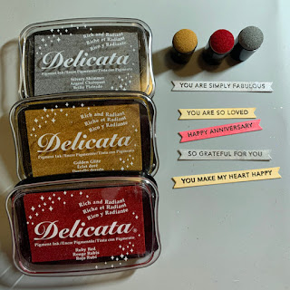
 For the next two weeks the challenge at Retro Rubber Challenge Blog is to use the Ombre effect.  Blend inks, find an ombre patterned paper, have some fun!  Check out how the Design Team interpreted this challenge!  As you can see by the graphic, you may go in any color direction you wish!

 I went with one of my favorite colors, purples to create my card.  I actually used snippets left over from other projects to pull this card together once I had the background completed.


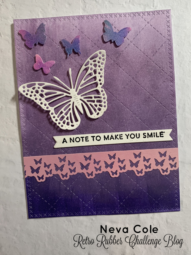
  • Using a Imagine Ink Blusher I added color to one edge of white cardstock (4 1/4" x 5 1/2") and dragged the color into the rest of the card.  The first ink I used was Versa Fine Clair Fantasia.  
  • To lighten up the ombre effect I switched to Memento Luxe Sweet Plum to finish the background.  A little Ink Potion #9 helped blend the colors.
  • The add interest the card front panel was die cut with the Concord & 9th Quilted Card front die and the Lawn Fawn Stitched Rectangle Stackables.  
  • Taylored Expressions Background (Original) Simple Strips Sentiment was stamped in Versa Fine Clair Nocturne and heat embossed with clear embossing powder, then die cut with the matching die.  The first set of Simple Strips was released in April of 2019.  It is mounted on two more die cuts to add a bit of dimension.
  • One of the snippets from my stash with a pink strip that had been border punched with the Tonic Butterfly border punch.  It glued to the card front and trimmed at the edges.  
  • A butterfly is cut from white cardstock using Cheery Lynn Design Exotic Butterfly, and adhered with a rolled up glue dot under just the body of the butterfly.
  • Impression Obession Butterflies die is used to cut another scrap that had very similar colors to the purple and are adhered with 1/8" dimensional foam adhesive.  These also happened to be in my snippets stash.

Please do come play along with our challenge at  Retro Rubber Challenge Blog.  We would love to see your projects!

CHALLENGE GUIDELINES

  • We require stamps older than one year.  If we feel you are using newer stamps, you may be disqualified from the challenge without notification.
  • New papers/dies are OK – but you must use at least one stamp older than a year and describe the age in your blog post.
  • Please note that all challenges require the use of at least one stamp older than a year.
  • Post your new creation to your blog or online gallery.   Use keyword RRCB194.  No backlinking. 
  • Link back to the blog using the Linky Tools by the due date. 
  • Enter as many times as you like. 
  • Feel free to combine our challenge with a maximum of 10 challenges.  Entries linked to more than 10 challenges will be disqualified without notification.
  • If your project is posted on a private group site such as Split Coast Stampers or a photo sharing site not all DT members may be able to comment.   Thank you for understanding.
  • Turn off Word Verification.  We love to comment but word verification can make that difficult.

Thanks for stopping by, your comments are always appreciated!

Thursday, January 27, 2022

New Techniques to add Texture for a Handsome Anniversary Card


Today’s tutorial will demonstrate how to create multi layers of texture for a dramatic Anniversary Card.  StazOn, Delicata, and Mboss will add amazing levels of metallic shimmer.

Skill:  Advanced

Time:  60 minutes

Directions:


Step 1


Trim white piece of sturdy cardstock to 4 1/8” x 5 3/8”.  I used the backing of a paper pack, that had one shiny white side.  First, I pressure embossed with Sizzix 3-D Textured Impressions Doodle Triangles.  A makeup sponge was used to spread StazOn Metallic inks from re-inkers in Platinum, Silver and Gold randomly around the surface of the card front.  StazOn dries on the sponge and makes it a one-time use tool. StazOn Jet Black ink is gently tapped over the raised portions of the card panel.  Set aside to dry or heat with a heat gun.


Step 2


Using a stamp from my stash (manufacturer unknown) small hearts were stamped randomly in VersaMark ink and heat embossed in Mboss in Valentine.


Step 3


Memento Luxe in Tuxedo Black is used to stamp Taylored Expressions Simple Strips Background sentiments followed by heat embossing with black embossing powder.  The matching die is used to die cut the entire set and five sentiments are selected for the front of the card.

Step 4


Each sentiment strip is inked with Delicata in Silvery Shimmer, Golden Glitz or Ruby Red with an ink dauber.  Since the sentiment is embossed, the ink will not change the color.


Step 5


The sentiment strips are backed with white cardstock with the matching backer die.  The edges are inked with Memento Tuxedo Black and an ink blusher to add definition.


Step 6


A Scribble Heart die by Impression Obsession is die cut from white cardstock.  The die is then inked with Versa Mark ink and heat embossed with Mboss in Valentine.


Step 7


A white card base is trimmed to 5 ½” x 8 ½”.  The edges are inked with Memento Tuxedo Black and an ink blusher.


Step 8


The card base is adhered to textured front with TearIt! Tape.  The Heart is adhered with OnPoint Glue.  The sentiment strips are adhered with dimension foam tape.  A striking masculine anniversary card goal achieved!


Art Supplies


Imagine

·      StazOn Re-inkers—Platinum, Silver, Gold

·      StazOn Jet Black ink pad

·      VersaMark ink pad

·      Mboss—Valentine

·      Memento Luxe—Tuxedo Black

·      Embossing Powder--Black

·      Delicata—Silvery Shimmer, Golden Glitz, Ruby Red

·      Memento Tuxedo Black

·      Ink Blusher

·      Ink Dauber

·      Tear It! Tape

·      OnPoint Glue


Other

·      Sizzix 3-D Textured Impressions Doodle Triangles

·      Make up sponge

·      Background heart stamp (manufacturer unknown)

·      Taylored Expressions Simple Strips Background Sentiments, Die, and Backer Die

·      Impression Obsession Scribble Heart die

·      Dimensional foam adhesive

·      Black and White cardstock

Wednesday, March 11, 2020

No River Required

I often create layouts in duplicate or triplicate for my kids' albums.  This was the case for this layout, three kids with memories to preserve, so three layouts. 


I found several patterned papers I wanted to use that were great colors for the photos, but I only had one sheet of each.  So the challenge was to create a layout that would use one third each.  I think I accomplished my goal! 

Several years ago I purged all my printed magazines as they were taking up room on my shelves and not being used.  Before I did that though, I salvaged articles and ideas for layouts that appealed to me.  This layout is based on an article from Creating Keepsakes Nov/Dec 2010, about using scraps. 

  • My Minds Eye Lime Twirl collection stripes and darker blue patterned paper, and Creative Imaginations Blue Scroll were used.  Bottom rectangles are 2" x 3".  
  • Top strip is 1" backed by 1 1/2" white cardstock.
  • Four punches were used to created the different size circle.  The punches are fast, compared to die cutting!  EK Succes, Fiskars, Marvy and McGill are all represented.
  • Bazzill green is the background, Darice Persimmon is the orange.
  • The journal strips are inked in Memento Danube Blue and written in Zig Writer Navy.  
  • The title was cut on my Brother Scan N Cut.  
A bit time consuming to create three of the same, but I am very pleased with the results.  Thanks so much for you comments and time to stop by!

Wednesday, October 23, 2019

Las Vegas Sights!

My husband and I recently traveled to Las Vegas for my Kodiak High School All Class Reunion.  We are not gamblers or drinkers, but we did enjoy seeing the sights and eating great food!  One of our stops was to a BRICK AND MORTAR local scrapbook store, ScrapbooksRUs.  I was able to find great papers to scrapbook our trip.  They are all custom papers by Scrapbook Customs that ScrapbooksRUs carries in the store.  The owner knew immediately we were from out of town and greeted us by saying "Where are you visiting from?".  The give away?  My spouse was with me as we came in the store.  Thank you dear husband for going to the scrapbook store with me!


I had too many photos to fit on a double page layout, but not enough to create another page or two.  So lift up the flap and see six more photos!


There were lots of colors in the Vegas Sights print, so I choose from those to complement the photos.  The Vegas Sights is two sided, and the B side is featured as the strips along the A side.  The yellow cardstock behind the Las Vegas Strip die cut is fussy cut to trim it down (literally) in size.

Thanks so much for stopping by and taking a look!  Have a wonderful day!

Sunday, October 13, 2019

Back to School 2010

Although we are in October, in a way it's still back to school time!  This layout is from 2010, when my older son dropped off his supplies for fifth grade.  He was in a blended fourth/fifth grade and had the same teacher for both years. It made for an easier transition into US schools.


I used bits and pieces I had left over from previous layouts from Appleton collection by Scenic Route.  I also play along with a sketch challenge over at 2peasrefugees, a just for fun forum about scrapbooking.
  • The background paper is White Lined Paper (yes, really that is the name!) also by Scenic Route.  
  • I wanted to bring out the primary colors in the paper so I used Memento Dandelion ink to color the Technique Tuesday Tile Fundamental Superstars.
  • Appleton Chipboard embellishments are added.
  • The circles are die cut with Spellbinders Circles Small.
  • A bit of the background paper was trimmed underneath the elements and used as journal strips.  The journaling is done in Zig Writer Blue Jay.
  • The title is from the Scan N Cut library, and was perfect to finish off this fun layout from a few years back!
As always know that I appreciate your visit to my blog, please leave a comment if you are so inclined!  

Thursday, October 10, 2019

Lava Cast Forest

Now that life is not so busy (well not really) I do have time to share a few layouts that I've worked on over the summer!

This layout was photo heavy so I kept the paper selections and embellishments simple to highlight the fun photos of the kids in the lava tubes.
  • The base is Kraft card stock with sections of ancient Provo Craft Paper Slab patterned papers layered along the edges. 
  • Bazzill Bacis Just the Edge Cardstock Strips are layered over the top.
  • Several sentiments from the Jillibean Soup by Hampton Art's set Enjoy are stamped in VersaFine Vintage Sepia.  Enjoy is die cut with the matching die, and the remainder I cut into embellishment strips.   The edges are inked with Vintage Sepia.  Echo Park Jungle Safari Enamel Drops are added to the ends of the embellishments. 
  • The journaling fills the two empty spots and is done in Zig Writer Chocolate.
  • The title is die cut from matching green and cream cardstock with Quick Kutz Frankie Classic. 
Thanks so much for stopping by!  I hope you enjoy this memory from almost 9 years ago.  It holds a special place in my heart as my dear friend has graduated to heaven, and I am thankful that I can document this time that she spent with our family. 

Thursday, June 6, 2019

Cousins

I have a few layouts I have completed recently, and now finally have time to blog and share with you.  This layout features photos from the summer of 2010.  Interestingly enough the paper collection is also from 2010, My Family by Fancy Pants Design!


Since I created two of these double page layouts, I used my paper carefully!
  • The background is Coredinations Distress Collection in the perfect blue-grey color.
  • Patterned papers are trimmed to 3/4", 1 1/4", and 2 1/2" by 12". 
  • The focal photo is matted with 5" x 7" patterned paper.  
  • Various embellishments are trimmed from the card part of the collection.
  • One side is of the one of the patterns is graph paper, perfect for the journal block and the title!
  • All of the edges are distressed with the Edge Distressor tool by Heidi Swapp.  Believe me I had a lot of paper crumbs all over my desk!
  • The title is Quickutz's Diesel font.  
  • The journaling is completed with a Zig Writer in Steel Grey.
Thanks for stopping by, your comments are always appreciated!  Come by again tomorrow to see a "companion" page of sorts that uses the same collection.

Monday, June 3, 2019

Redwood Shores for SID June Double Page Reveal

This is such a great sketch for the month of June.  Come have some fun with us at Stick It Down!


This time last year I visited the San Francisco Bay area with my husband.  He was speaking at a symposium, and I took the opportunity to explore the area around the hotel by walking around the Redwood Shores Lagoon.  It was a lovely walk.  I modified the sketch a bit by using five photos instead of four, with the center photo being one that could straddle the two sides of the layout.  I also had some fun with the diagonal pattern paper.


The colors of the photos worked perfectly with the Euphoria collection by Basic Grey that I loved so much I bought all of the embellishments too!  A few are included in this layout.
  • A trick for making diagonal strips for your layout is to cut the paper on the diagonal, rather than trimming straight 1 1/4" x 12" strips.  for this layout I measured down 3 1/2 inches from the top edge and trimmed the diagonal.  Using a paper trimmer I cut 1 1/4" along the same diagonal to create the strip.
  • All the strips are trimmed with this measurement to keep the them parallel for the layout. 
  • The green pattern needed four strips to complete the line across both sides of the layout.
  • The pink pattern needed three strips for the layout.  After adhering the stripe I trimmed the excess from the back of the layout.
  • The blue strip was actually from a scrap and started as 1 1/4" x 12".  
  • The darker pink pattern used one strip.
  • The patterned paper is adhered to Bazzill cardstock.
  • I selected a few Euphoria Chip Stickers and Rub-ons to complete the embellishments. 
  • Each of the photos has a small journal strip caption from Coordinations cardstock.  Zig Writer in Orchid was used for the journaling.

Stick It Down is a monthly challenge that includes sketches for double page layouts, single page layouts, and cards.  Do come join the fun!

Wednesday, March 27, 2019

We Love Our Puppy

Typically I am not a single photo on a layout type of scrapper, but this photo deserved it's own page.  My four-year-old son had his face painted at a local street event and wore the paint for the rest of the day.  Once he got home I snapped this adorable photo.  The challenges over at Rochelle Spears and Scrap Your Stash were a great fit for this layout.


I have about 6 inches of Provo Craft light weight paper in my stash that I dug through to find all of the coordinating patterns and colors.  Once that was done the layout came together quickly, that is the beauty of using a sketch for inspiration!

  • All three mats that back the photo are trimmed to 4 1/2" x 6 1/2".
  • The striped pennant is 2 1/2" wide because that is the largest size that fits into my new Paper Studio Pennant Punch.
  • Rings are die cut with two sizes of Spellbinders Standard Circles Large and Small.  They are about 4" in diameter.  I use Zig glue to carefully adhere them to the layout.
  • The tag is also 2 1/2" wide because I have another punch by Paper Studio punch that punches tag tops.  To finish the tag I punch a 5/8" circle and adhered it to the tag before punching the center whole.  It is finished with a ribbon bow, made from ribbon out of my stash.
  • I searched through my pet embellishments to find a few things to create the cluster.  KI Memories made Lace Cardstock titled Dirt Treats that I had sprayed with a few different Tsukineko Walnut Inks from the Spritzer Workstation (Eucalyptus, Terra Cotta, and Walnut) to make a background for another layout.  I still had the "mask" in my stash.  I trimmed a small corner to be the base of the cluster.
  • A Coluzzle template allowed me to cut the perfect size heart to layer over the top.  
  • Two paw print die cuts from my stash topped the cluster.  
  • With the dark background it was time to pull out the white sticker letters.  Swirly White by Creative Memories spelled out the title. 
  • I used my first try at the Coluzzle heart to journal and finish the layout.
Thanks for checking in here at Finding Snippets of Time to Craft, I hope you are finding snippets of time to craft in your neck of the woods! 

I was inspired by the following challenges:  
Scrappy Friends March--I was inspired by the love, circles and the puppy images in her layout!

Monday, March 25, 2019

Fourth Grade Memories

If you have been scrapbooking for awhile like I have, you undoubtedly have a few page kits in your stash.  I've made it a goal to use up these wonderful gems, and here is an example that features a kit from embellish it! from 2013 with a few changes.

  • The kit features Simple Stories 24/7 including Red Tweed Calendar, Good Stuff, and Journaling Card Elements.
  • The Journaling Card Elements are trimmed apart and used as embellishments through the layout.
  • Cast Away Lazer Cork "Memories" was part of the kit, as were the mini film strip, twine and buttons.  I used the twine on one of the journal card elements that is cut apart into journal strips.  I also added some red craft thread to the buttons for little bows.  I don't like empty button holes!
  • The additional title words are DCWV Cork Stack die cut with Quickutz Frankie.
  •  Another plus of journal cards?  They can be used to journal a layout!
This kit was designed for four photos, but with a little creative use of the journal card elements I was able to pull off a cohesive layout.  Another layout complete for my son's album!  Thank you for leaving a comment when you stop by, they are always encouraging!

Saturday, March 23, 2019

We love Snow, (just not 28" in 48 hours)

Winter came late this year in Central Oregon . . . February 25th to be exact.  Lots of snow in a short amount of time.  Four snow days from school as the city and county could not keep up with plowing the roads, even though the fourth day was blue-bird clear and beautiful!  As the journaling indicates, we all contributed to moving snow, and had fun playing outside.  I captured some stunning photos from our back deck, one in the early morning capturing the sunrise, moon and Venus.  The second is actually also looking the same direction but at dusk when mist was forming over the snow fields around our home.  These two photos directed my color choices.


  • The background is really old Creative Imaginations Snowflake paper that I've have for probably 15 years!
  • Two pieces of white cardstock are trimmed to 5" x 12", and 2 1/2" x 12 inches.  Martha Stewart's Aspen border punch set punches out the small snowflake pattern.  
  • Needing a bit more color I trimmed lavender cardstock to fit the area and pressure embossed with Darice Snowflake background.  To bring out the snowflakes the surface is sanded.  
  • The two focal photos are backed with coordinating cardstock.
  • The title is Quickutz Frankie Classic and Shadow along with Frankie Mini.  The larger letters are embossed with Quickutz Goosebumps Sparkle.  After adhering to the backing letters I sanded the surface to bring out the design.
  • I inked Studio Calico wood veneer snowflakes with Memento Luxe Wedding Dress, and a heart with Versa Magic Spring Posies.
  • The journaling is done on white cardstock and using Microsoft word and creating text boxes.  The edges are inked in Versa Magic Spring Posies.
Another winter in Bend, and another beautiful snowfall.  It is taking a while for the all snow to melt, many parking lots and side streets still have a great piles of snow!  Thanks for stopping by and I truly enjoy reading your comments!

Friday, February 22, 2019

Silverton Duals

I tend to scrap within the season even if it is from a few years back.  This is another layout for my son's senior album using photos taken in December 2017.


  • The background is Core'dinations Black Large Stripe.
  • One sheet of Wrestling Life 2b by Scrapbook Customs is used to back both sides.  On the right side it is trimmed to 8" x 8" to back the team photo. 
  • On the left side the photos are blocked together and adhered to a square of cardstock to hold them in place.  The Wrestling Life is then trimmed and added to the outside to create the illusion one backing sheet.
  • Recollections red cardstock is trimmed to back the team photo and die cut with Spellbinders Classic Ric Rac and Classic Inserts Two for the border sections.
  • Sandy Lion Glitter washi tape is used to finish the border edges. The main title is die cut from red cardstock with Quickutz Abigail
  • The sub-title under the team photo is Creative Memories White stickers. 
  • Journal strips of black cardstock and white Sakura Gelly pen finish the layout.


Thanks for stopping by, your comments are always appreciated.

Sunday, February 10, 2019

MVHS Wrestling

Now that my design team commitments are a bit less I've gotten back to scrapbooking a few events that have been my to do list for awhile!


This is a layout about my son's Freshman year in High School Wrestling Season.  Wrestling is an interesting sport to photograph, as there can be many odd body positions and the lighting and speed of the action can be difficult to say the least!   I picked a few of my favorite photos to highlight, mostly where he is dominating the match!
  • Darice Black Large Dot is used for the background.
  • Karen Foster Design--Take Down paper features wrestlers in different poses.  I trimmed a section that showed two vertical rows.
  • Darice Red Strip is trimmed to 3/4" 12" and then die cut with Spellbinders Edgeabilities Classic Postage Stamp.  These are placed behind the Karen Foster Take Down paper and adhered to the layout.
  • Darice Red Plaid is trimmed to 7" x 12" and adhered to the right side of the layout.  
  • From the same sheet another section is trimmed to 5" x 7" to continue the pattern on the left side.  This is possible when the paper design is multi-directional like the plaid paper is.
  • Frankie Classic and Shadow used to die cut the title.  I found some soft grey paper in my stash that was a good match for color. 
  • The journaling is printed out from a word document and trimmed into strips.  The edges are sanded to bring out the white core and help the journaling stand out on the layout.
I learned a little trick accidentally while doing this layout.  I printed the photos more than a year ago, but was still able to identify where each photo was taken!  I import my photos into Photoshop Elements and edit for size and to optimize the photo quality.  When I saved each photo I labelled it with the name of the event.  Low and behold Costco printed the label of the photo on the back!  Such a deal, I will remember this for future projects as it surely made journaling this layout super easy rather than having to go back and search through my photo library and line up the dates from more than four year ago.

Thanks for stopping by!

Monday, February 4, 2019

Learning the Game for Stick It Down Double Page Team


We have a great sketch for you this month at Stick It Down, come play along with us!   

My younger son played football for the first time last fall.  He didn't get a great deal of playing time and when he did play it wasn't always easy to get good photos in late afternoon light from across a football field.  So I only had a few photos that were scrapbook worthy and this sketch was perfect for the few I did print.
Digging through my stash I found great sports related papers and embellishments.  I also made a few purchases online from Consumer Crafts to have a selection of patterned papers in appropriate school colors.  All three of my kids will go to the same Middle School and High School, so having multiples is a good plan!
·       The background is Recollections silver cardstock. It is also used for the title .
·       Darice Dark Blue Plaid is the layered cardstock trimmed to 10 1/2" x 12".
·       The football field paper is from a 20 year old 8 1/2" x 11" paper book by Hot Off the Press, a good reason to hang on to your ancient paper stash as it fit perfectly for this theme and sketch!
·       The football words paper is by Essentially Yours Sports designed by Stephanie Carpenter for A2Z. It is trimmed to 5 1/2" x 12". 
·       I had some 10 year old rub-ons by Creative Imaginations that worked amazing well.  Football by Danelle Johnson for Art House. I used them to create the semi-circle design.  I am super pleased that they worked so well and really added to the design and theme,
·       A Deluxe Cuts football die cut finished the sketch embellishments. 
·       The title is Quickutz Abigail as is the sub title. 
·       I completed the layout by journaling on strips.  The strips are edged in Memento Paris Dusk for a finished look. 
I hope that you enjoyed my more masculine interpretation of Stick It Down's sketch for February.  Come play along with us.  We also have a card sketch and single page sketch every month.

Thursday, September 20, 2018

Quick Quotes Mini album from Club Q kits

Hello Quick Quote friends!  Neva here to share a mini album created from September's Club Q kits.  I used all the parts of the Ultimate Combo Club Q to fashion the twelve pages of this 6" x 6" album.  Recently I scrapped a few photos from this event, my parent's Sixtieth Anniversary Celebration.  My mother's wish for the weekend was to take many family photos and individual photos that showed each family member's personality.  With a little perseverance we granted her wish . . . the first round of photos were not of good quality as settings on her camera had been adjusted from auto to manual.  But we believe round two of photos turned out even better!


Three sheets from the page kits were used to create the pages, one sheet of Main Street 101 and two sheets of Main Street 102.  The remaining sheets from the page kits and Altered kit were used to mat the photos.  Accents from Main Street 103 were cut from the scraps from the Altered Frame kit.  Design Team members were sent Main Street Quotes and Phrases 600 which is used throughout the album including the opening title.


To guide you through the process I used to plan and create this mini album I will share a few insider tips.
  • I start with a paper planning grid to determine the sequence and placement of photos.  You will notice I added an extra page as I had most of the planning done and wanted to change the order of the photos.
  • Photos are printed in three sizes:  4" x 6" and trimmed down to varying sizes, 3" x 4", and 2" x 3".
  • Each of the three sheets are trimmed to four 6" x 6" base pages, for a total of twelve.
  • Each 6"x 6" page is laid next to it's companion and the photo mats and embellishments are selected.  
  • I made an effort to vary the embellishments from the two page kits, the Chipboard Die Cuts, and the Quotes and Phrases, throughout the album.  The similarity between the two page kits made this easy, but added a nice variety to each layout.
  • Some companion page backgrounds match, others are complementary.  Complementary layouts feature the background on one side and photo mats on the opposite that match.
  • All the elements for each page set are put in envelopes to finalize the design, as a few embellishments were moved around in the mini album before final assembly.  
  • The journaling strips were created in a Word document and printed in brown then are inked in Mocha Mama Powder Puff Chalking Ink.  Not all are included for publication to protect privacy.
  • Ribbons were tied into bows and added to the pages that needed that last little embellishment. 

Front Cover:
  • Photo is trimmed to 3 1/4" x 5", and backed with 102 white dots that is 1/4" larger all around for a frame of 3 3/4" x 5 1/2".  All of the larger photos have this mat sizing.
  • The mat is inked with Powder Puff Chalking Ink in Bermuda.
  • The 101 grunge side page is inked in Powder Puff Chalking Ink Mocha Mama as is the "Bless this family" sentiment.  What a great sentiment from the Main Street Quotes and Pharses 600! 
  • The photo and sentiment are adhered at slight angles to allow both to fit the page with a bit of overlap.
Pages 2 and 3
  • These pages feature my parents and my siblings and uses teal 101 for the left and grunge quarter 102 for the right.  The mats are the 102 for the left and 101 for the right to tie the pages together.
  • The accents are used directly from the page kit, along with a bow made from the ribbon from the Small Altered kit.

  • A hidden a flap lifts to reveal a fun photo and story.  We had a great time recreating a photo that we gave my parents in 1981 when frizzy perms were a thing for men.  My niece crouched behind my brother so her curly hair would give him the illusion of his hair back then.  We obviously could not keep a straight face!
  • Barn Board Powder Puff Chalking Ink is used to ink the elements of these pages.
  • With care, one ink color can be used on one side of the page and a different color on the opposite side.

 Pages 4 and 5
  • Both sides use dotted 102 for the page and 102 teal side for the mats.
  • The accents are used directly from a page kit, as is the gingham bow.
  • The large circle is trimmed asymmetrically to add interest and tie the two pages together.  I also like to think of the symbolism of our wedding rings!
  • Bermuda Powder Puff Chalking Ink is used to ink the elements of these pages.

Pages 6 and 7
  • This layout shares a bit of my parent's personality!  It features 102 quarter grunge side.  
  • The smaller photos are 2" x 3" and the mats are 2 3/8" x 3 3/8".  
  • The smaller mats are more proportional to the smaller photos by framing the photo with 3/16" on each edge.   
  • The red mats are trimmed from the scraps of the Altered Frame kit as Main Street 103 is featured as an accent in September's Club Q.   The teal mats are 101.
  • Mocha Mama Powder Puff Chalking Ink is used to ink the elements of these pages.

Pages 8 and 9
  • There are some really great sentiments in the Main Street Chipboard die cuts that are perfect for layouts about families.  This one is fantastic to represent the younger generation of our family!
  • Both Mocha Mama and Bermuda Powder Puff Chalking Ink are used to ink the elements.
  • Pages are 102 dotted and 101 grunge for the mats.  

Pages 10 and 11
  • My family is featured in these pages, so the journal strips are included.  
  • The background is 102 grunge quarter and the mats are 101 teal.
  • Mocha Mama Powder Puff Chalking Ink is used to ink the elements.

Pages 12 and 13
  • Personality photos for my family on 102 dotted pages. 
  • The frames area 101 grunge and a scrap of 103 red for the large photo.
  • The banners are trimmed from Main Street Quotes and Phrases and have holes pierced through the corners.
  • Twine is threaded through the banners before the are adhered.  
  • Both Mocha Mama and Bermuda Powder Puff Chalking Ink are used to ink the elements.


Pages 14 and 15
  • These pages feature my brother's family.  
  • Opposing backgrounds and mats are used in this layout.  The quarter grunge of 102 and the teal side of 101. 
  •  Mocha Mama Powder Puff Chalking Ink is used to ink the elements.
  •  I really like how the patterns of the papers show up in the Chipboard Die Cuts!  All three embellishments have the dotted side of 102.

Pages 16 and 17
  • More photos of my brother's family.  
  • Grunge 101 is used for the background.  The mats are a mix of 102 quarter grunge and 103 red.
  • I almost forgot to use the great little chipboard banners from the page kits, they finally show up here!  They are inked in Bermuda Powder Puff Chalking Ink.
  • Black and red twine are threaded through the buttons before they are adhered.  I enjoy adding these little touches to bump up the effect of buttons!
  • The mats and Chipboard Die Cut are inked in Mocha Mama Powder Puff Chalking Ink,

Pages 18 and 19
  • These pages feature my sister's family.
  • These pages are complementary with 101 teal and 102 quarter grunge.

  • Another hidden flap hides the photo of my sister's family and their plus one, my niece's (now) fiance.  :)
  • Chipboard Die Cuts are the embellishments.
  •  Bermuda Powder Puff Chalking Ink is used to ink the elements.

Pages 20 and 21
  • More photos of my sister's family.
  • True story about the sentiments selected.  My niece moved to a remote town in Alaska with a population of less than 1,500 people to take her first teaching job . . . and she met her now fiance!  The school district is pleased as they will have a music teacher who stays longer than a year.
  • The pages are dotted 102, with mats of teal 101 and red 103.
  • Both Mocha Mama and Bermuda Powder Puff Chalking Ink are used to ink the elements. 

Pages 22 and 23
  • We have a tradition of taking group photos of birth order.  We did it at my Grandparent's 50th Anniversary 30 years ago, and it was fun to take these in August!
  • Quarter grunge 102 and teal 101 are the background, with complementary mats.
  • I used up the last few bits of the pages kits for embellishments, love it when you get to the end of a project and have very little left! 
  • Another great sentiment from Main Street 600 Quotes and Phrases.  
  • Mocha Mama Powder Puff Chalking Ink is used to ink the elements.

Back Cover
  • Grunge 101 with the title from a page kit.
  • Mocha Mama Powder Puff Chalking Ink is used to ink the elements.
Final assembly
  • I used a Bind-It All tool to punch the holes and bind the mini album together.  A similar tool can be used to bind the album.
  • Alternately, the holes can be punch through each page and binder rings can be used to finish the album.
  •  Because the pages are smaller and are not placed in page protectors, I choose to adhere the Chipboard Die Cuts with additional glue dots to insure they would stay put!
Making mini albums is a passion of mine, and I am thankful that the elements of the Ultimate Club Q Kit worked so well together to create a cohesive but fun mini album.  Thinking outside the of the kit can be really fun and a satisfying crafting experience.


Here is my version of the Large Altered Kit, I always really enjoy making a Quick Quote Canvas!  They always turn out so beautifully!  I used a different Main Street Chipboard Die Cut, and punched holes to insert the brads.  Shhhhh, this will be a gift for my parents!

Quick Quotes Products
Club Q Ultimate Combo Kit
Main Street Quotes and Phrases 600--coming soon
Powder Puff Chalking Ink in Mocha Mama, Bermuda, Barn Board

Other Products
Twine from my stash
Bind-it-All tool and wire by Zutter
Spice and Ocean by Zig Writer
Bakers twine from my stash


Thanks for stopping by today!  Neva