Showing posts with label Stick It Down Double Page DT. Show all posts

Monday, May 4, 2020

Stick It Down Double Page Drill Team Reunion

Hello all!  A few months back I attended an All Class Reunion for my High School located in Kodiak, Alaska.  We had four members from our junior year that were all on Drill Team Together.  These photos were perfect for this month's sketch from Stick It Down!


I choose to use school colors of Blue and Gold to scrapbook the page and add embellishments that represented our High School and mascot, the Kodiak Bear!


  • The base cardstock is two toned, so the die cuts and journal strips are the reverse of the base cardstock trimmed from behind the patterned paper.
  • Core'dinations Yellow Small Dots, and Dark Blue large dots, Darice Yellow Stripes and Dark Blue Plaid, along with some ancient Provocraft Slab II Yellow Plaid are used to create the sketch.
  • Blue ribbon from my stash adds the final background section.
  • The Bear is did cut from a file from the Silhouette Store.
  • The KHS emblem is designed from the Varsity font also from the Silhouette Store.
  • The title is die cut with a font on my Scan N Cut.
I am so pleased that I had so many patterns to work with on this sketch, why don't you give it a try and join us at Stick It Down! this month!

Monday, April 6, 2020

April SID sketch, State Wrestling

How much our everyday life has changed in the last few weeks.  I pray that you and your loved ones are safe and healthy as we weather this pandemic together.  We over at Stick It Down will continue to provide inspiration with our monthly sketches for cards, single page layouts, and double page layouts.  April's double page layout features a large photo.


My choice was to use a photo I purchased from the professional photographers at my older son's state tournament appearance.  I also went for a really BIG title.  I am happy to report that my son was pleased with the layout.


  • I have a collection of wrestling related papers from Stamping Station AKA Scrapbook Customs.  If you have need for a particular sport this is a great place to purchase theme related papers.
  • I keep the cardstock simple and used school colors of red, black and white.  
  • The smaller team photo is backed with Darice Large Black Dot.  The photo was taken from a distance on a balcony above the event center main floor.  I am still pleased that I captured this moment.
  • The wrestlers and singlet cut files are purchased on Esty from PenAndPosh
  • The white script is from Silhouette Sweet Tea font and the red is a font on my Brother ScanNCut.  
During this time we are all dealing with a myriad of emotions depending on our situation.  For me and my family I am at home on 6 acres with my husband, two sons, and four German Shepherds.  We have plenty of chores and activities to keep us sane and happy.  My husband is able to work from home, but as a substitute teacher my services are not required.  I am the family errand runner, so am taking great care to stay safe and clean! 

Do take some time to be crafty!  For many of us it is an escape and therapy!


Monday, March 9, 2020

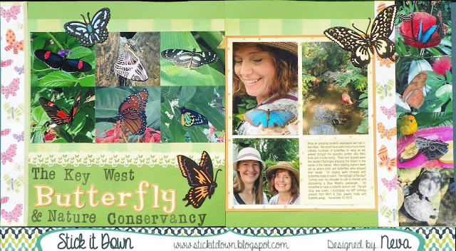
Butterflies for SID March Double Page Reveal

Even though my photos were taken last fall (in Florida) they are perfect for a spring green layout.  We have several fun sketches for you over at Stick It Down.  Not only a double page, but also a single page, and card sketch to play along with for the month.  Check it out!


For my layout I choose to add more photos, by making them smaller.  There are too many wonderful things to share from this experience at The Key West Butterfly and Nature Conservancy.  (At least I had the long title!)


I tried several different colors of background cardstock before I finally decided on the green.  With the bright colors of the butterflies and fun patterned paper I think it holds the layout together.
  • A very old collection by Me & My Big Ideas by Ellen Krans (2006) had all the selections of coordinated paper to make it easy to put together.  
  • Paper Studio light yellow washi adds a dash of pastel to the eges of the butterfly paper.
  • I love butterflies, and sometimes (well often!) will buy a stamp or die just because it is a butterfly.  The Cuttlebug Anna Griffin Butterfly Trio was just such a purchase.  Look how wonderful they are as embellishments for this layout.  If you look closely some of the highlights are colored through the die with Writer Chalk Collection markers.  I also backed each butterfly with a matching die cut by scanning on my Brother Scan N Cut and die cutting coordinating cardstock to put behind the butterflies.
  • Another butterfly tool in my stash is the Tonic Butterfly border punch.  I just had to use it in this layout as an add on embellishment.  The top edge is punched with EK Bubble edge border punch.   
  • The title is a combination of Stampabilities Vintage Type alpha stamped in Tuxedo Black Memento Luxe and Quickutz Tangerine & Shadow.
  • The yellow and orange dot patterned paper is backed with orange cardstock, and the journaling is printed on yellow cardstock that is the exact color of the patterned paper.
Do come and check out the blog and give one of our sketches at Stick It Down a try.  It will be fun!

Thanks for stopping by your comments always make me smile!

Saturday, February 1, 2020

Stick It Down Double Page for February

This month we have a great couple of sketches over at Stick It Down.  As always we have a Double Page, Single Page and a Card Sketch for you to play along with during February.  I am debuting the Double Page sketch with my take on the sketch.


As you can see the design is perfect for a Valentine's Layout.  But I decided to go a different route, one that show cases my stateroom from my recent scrapbooking cruise.


 I had never been on a cruise before, so everything was documented, including our 170 square foot cabin. 
  • I matched some DCWV light mint green cardstock to the Carta Bella Ahoy There collection for the base of the layouts.
  • The B side of Waves and the B side of Let's Sail were trimmed to fit the sketch.
  • I purchased the cruise ship cut file from the Silhouette Store and cut it with my Brother Scan N Cut.  Not wanting the place all those tiny little pieces with a second cut in black, I then traced the outline of the ship, scanned and then cut the result.  I never did figure out how to accomplish the same thing in the software!  Hum, something new to learn!
  • The Nautical embellishments were also purchased from the Silhouette Store and cut from coordinating cardstock.  
  • The Memories by the sea title is from Quick Quotes and is inked with the darkest ink on the Kaleidacolor Denim set with an Ink Dauber.
  • The remaining part of the title is die cut using Honey Classic, Honeybee Classic and Santa's Workshop all by Quickutz.  The die cuts are inked with Kaleidacolor Denim as well.
  • My Sea Pass fit great with the theme and was used as part of the embellishment cluster  
I have many more layouts to work on to document this really fun experience from last November.  I hope to do it again someday!

Please do check out the sketches over at Stick It Down, and come play along!  We would love to see what you create!

Monday, January 6, 2020

Hoover Dam Double Page layout for Stick It Down

Hello everyone!  So glad to be back into the swing of things and crafting!  We have a great set of sketches to start the new year and decade over at Stick It Down.  Go check them out!  This is the double page sketch for January. 


I am really loving how it worked so well with photos from my recent trip to Las Vegas, where we drove over to tour the iconic Hoover Dam.  I actually ordered some of the photos taken at the Dam . . . that would feature different backgrounds.  You can only order the photos in this size so it was perfect for this sketch!

 Hoover Dam was built in the era when Art Deco was the style.  All of the art and interior motif was incredibly well preserved Art Deco, a testament to a great aesthetic!

I started with paper purchased at ScrapbooksRus in Las Vegas, Scrapbook Customs Old Antique and Old Antique Words.  The title was printed for me, yeah!    To keep with the Art Deco theme I choose Spellbinders Moroccan Accents and Moroccan Motifs and die cut grey and blue cardstock embellishments.   To trim the corners of the grey cardstock journaling blocks I pulled out the ancient Fiskars Nostalgia Corner Edger.   A little journaling and the layout is complete.  Now to print and scrap all the other great photos I took during the tour!

Thanks for stopping by and please do come play with our sketch this month.  It is really a quick and easy sketch to complete over at Stick It Down

Monday, December 2, 2019

December Stick It Down Double Page

Here we are with the last sketch of the year for Stick It Down.  A great one for all those Christmas photos you undoubtedly have!


Here is my version of the sketch, which I recreated for four double page spreads.  I was able to use a two sheets of Kraft cardstock and three sheets of patterned paper for all four layouts!  I am really pleased with the embellishments I stamped to match.


Monday, November 4, 2019

November Stick It Down Double Page Sketch

Normally I like to use the sketch within the season, but I just happened to have the exact number of photos already printed for this layout that fit this month's Stick It Down sketch perfectly!  So a summer themed boy layout it is!


My photos aren't the exact size, and I moved them around just a bit, but I do love the gears as embellishments!


I had purchased specific patterned paper to complete this layout and the sketch was helpful in stretching the paper over two duplicate layouts, one for each boy's album.
  • Two sheets of American Crafts Bicycles were trimmed in the direction that matched the layout.
  • Core'dinations Light Aqua Plaid was trimmed for the layouts.
  • Craft Smart Embossed Cardstock was a perfect color match and one sheet was trimmed for the layouts.    
  • Using Sizzix Tim Holtz Alterations Gadget Gears and Spellbinders Donna Salazar Sprightly Sprckets I die cut a variety of gears for embellishements.  I used the Craft Smart Embossed Cardstock, a sheet of coordinating light aqua cardstock from my stash, and DCWV Metallic Silver cardstock to create the gears.  
  • Since the background was white I used the light aqua cardstock from my stash and stamped Recollections Grunge Alphabet with Memento Luxe Teal Zeal to create the title.  My Brother Scan N Cut made quick work of electronically die cutting the letters.  
  • I added the journaling underneath the title, as there was a fun story to go with these photos.  The man who was the biggest "master mechanic" did so just for fun, Dad got in on the action a little too, but Kurt just enjoyed teaching a 10-year-old how to fix a flat!
This layout was a bit time consuming to complete, but once done I am really pleased with the results.  Do give this sketch a try, or one of the other sketches over at Stick It Down.  Thanks for stopping by Snippets of Time to Craft!  

Monday, October 7, 2019

Carving Pumpkins for Stick It Down

Stick It Down has a really fun sketch for the double page layout this month!  (We also have sketches for the single page as well as a card so check it out!)

It has a decidedly fall theme that can be switched out for your favorite season or theme.  I had some photos from last fall to scrap, so I went with the pumpkins and Halloween theme.


Searching through my stash I found a great collection by Imaginisce, Hallowhimsy Collection that was perfect for putting together this layout.
  • The background is part of the collection with the subtle spider webs.
  • Both sides of several sheets are used to create the coordinating tags to match the tag from my stash.  A 1/2" circle punch and the Cropidile is used to create the reinforcement holes.    The edges are inked with Delicata Black Shimmer to add definition.  
  • My new Brother Scan N Cut came in handy with all the pre-loaded Halloween images.  I used all of them in smaller sizes to create the die cuts. 
  • For the title I down loaded Silhouette's "Carving Pumpkins" file.  To help is stand out a bit more I outlined it in Black Zig writer.   
  • To add the border I used Paper Studio Pumpkins washi tape.  
  • The dotted tag needed a little sprucing up so I added Happy Halloween washi tape on a diagonal.  
I had a lot of fun creating this layout with the sketch this month.  It is a great way to incorporate several themed papers together, or to use up scraps from a collection.  Thanks so much for stopping by and come play along with us at Stick It Down this month!

Monday, September 9, 2019

Stand Up Paddleboarding for Stick It Down

The summer just sped by and here we are starting fall!  I wanted to celebrate summer a little longer so my September layout for Stick It Down features photos from our camping trip at Dillon Reservoir in Colorado.


Dillon Reservoir is the highest in the US at 9017 feet, hence part of the title.  It has several campgrounds, but may be better known for Summit County  and home to several ski resorts.  This layout is to celebrate the new sport I took up this year, and paddling on Dillon was one of the highlights of the summer.  

  
  • I wanted to keep the focus on the photos so I keep the design true to the sketch but clean and simple.
  • FYI, all the photos except the one of me were taken through my dry bag!  
  • The background is a blue cardstock from a Michaels blue combo pack.  Perfect color to match the color the sky!
  • I went shopping around on Etsy for SVG cut files to match the scenery.  The mountains are from thesvgearth Mountain SVG Bundle.  The Trees are from MandarinSVG Forest SVG, and the SUP are from SmilingWild SUP silhouette SVG.
  • Each file is cut on my Brother Scan N Cut after being sized to fit the layout.  Each color of cardstock is from my stash.
  • The Mountains and Trees are shaded with Square Pastels.
  • The papers are all Provo Craft from their ancient stabs bought at Michaels more than 15 years ago, except the evergreen trees.  It was in my stash and has no label. 
  • I got out my trusty Quickutz from the tall but slender Abigail font for the main title.  The dates are a mix of Olivia and Stiletto (for the slash and dash).  
  • Since I had so much to say I really wanted to type my journaling . . . MSW didn't do the trick so a quick tutorial on Youtube and PSE came in really handy!
Do check out the rest of  the Stick it Down Double Page Layouts and the fun sketches for single page and cards too!

Thanks for stopping by and enjoy the fall!

Monday, August 5, 2019

5th Birthday for Stick It Down Double Page Reveal

This is a great sketch that can be easily manipulated to add a few more photos.  Head on over the Stick It Down and check out the rest of the Design Team's layouts! SID also has single page and card sketches to play along with every month.


I had more photos than what the sketch called for, so I sized them down and put together the layout.


  • I choose Echo Park Paper Company's Happy Birthday Boy Collection to highlight all the bright colors in my photos.
  • Both sides of Age is Just a number is trimmed for the numbers and orange sections.
  • Birthday Hats is also used along with the Element Stickers.
  • I found some aqua colored cardstock in my stash that was a perfect match to the color scheme to use as the background for the layout.
  • The "5th" is a very old sticker font by Pebbles.
  • I had a rather long story to tell so the journaling is done on the computer.
Thanks for stopping by and do enter in and join the fun at Stick It Down!

Monday, July 8, 2019

Double Page for Stick It Down, Soccer Season in one Layout!

I just loved how quick and easy this layout went together with this fun sketch from Stick It Down!


I am working through some events from a few years back and wanted to get all of one Parks and Rec Soccer Season in one layout.  Many soccer photos are best as landscape, so using three photos that are 3 1/2" x 2" took the place of each portrait photo.


  • I stayed fairly true to the sketch, using 3 3/4" circles around the perimeter.  I used Autumn Leaves (blue check with soccer balls and sayings) and two Stamping Station papers, Soccer Typewriter and Soccer Sayings.  
  • The ball soccer balls are ancient Queen & Co Felt Fusion.  
  • The top border is a ribbon from Bobbin Ribbon. 
  • I have a new toy!  A Brother Scan N Cut SDX 225, which I used to die cut the title.  with a little experimentation I used painters tape to keep the letter spacing and applied liquid glue to the letters to adhere them to the layout.  
  • With so much going on already on the layout, I choose smaller embellishments form a Stick-a-bilities set for Soccer.  The colors were perfect!
Always glad to have another layout completed and memory preserved . . . even it if is from a few years back! Have fun with this sketch and come play along with us at Stick It Down!

Monday, June 3, 2019

Redwood Shores for SID June Double Page Reveal

This is such a great sketch for the month of June.  Come have some fun with us at Stick It Down!


This time last year I visited the San Francisco Bay area with my husband.  He was speaking at a symposium, and I took the opportunity to explore the area around the hotel by walking around the Redwood Shores Lagoon.  It was a lovely walk.  I modified the sketch a bit by using five photos instead of four, with the center photo being one that could straddle the two sides of the layout.  I also had some fun with the diagonal pattern paper.


The colors of the photos worked perfectly with the Euphoria collection by Basic Grey that I loved so much I bought all of the embellishments too!  A few are included in this layout.
  • A trick for making diagonal strips for your layout is to cut the paper on the diagonal, rather than trimming straight 1 1/4" x 12" strips.  for this layout I measured down 3 1/2 inches from the top edge and trimmed the diagonal.  Using a paper trimmer I cut 1 1/4" along the same diagonal to create the strip.
  • All the strips are trimmed with this measurement to keep the them parallel for the layout. 
  • The green pattern needed four strips to complete the line across both sides of the layout.
  • The pink pattern needed three strips for the layout.  After adhering the stripe I trimmed the excess from the back of the layout.
  • The blue strip was actually from a scrap and started as 1 1/4" x 12".  
  • The darker pink pattern used one strip.
  • The patterned paper is adhered to Bazzill cardstock.
  • I selected a few Euphoria Chip Stickers and Rub-ons to complete the embellishments. 
  • Each of the photos has a small journal strip caption from Coordinations cardstock.  Zig Writer in Orchid was used for the journaling.

Stick It Down is a monthly challenge that includes sketches for double page layouts, single page layouts, and cards.  Do come join the fun!

Wednesday, May 1, 2019

Stick It Down May Reveal Jumping on the Tramp

We have a really fun sketch for May at Stick It Down!  I knew that this sketch would be perfect for a sequence of photos taken by my Mom of my boys on the trampoline.


My version moves the photos apart just a smidge to highlight the triangle shapes. Most of the photos lined up so closely that the sky from one photo blended into the next, so the small separation works really well.


  • I started with yellow cardstock and three patterns from Me and My Big Ideas Boy collection.  
  • Just a little tip to help you get the triangles to fit together well and closely match the sketch.  First print the sketch design in a Word Document 6" wide.  It is easy to measure and size up the sketch because the ratio is 1 to 4.  In the sketch the edge of the triangle is 1 1/4", so my photo edges are 5".  (1.25 x 4 = 5)  I decided where I wanted the center of the photo on my 4" x 6" prints and placed them on a cutting mat.  Each photo is then cut on the diagonal 2 1/2" from the center point.  
  • Once the photo sequence is placed on the background I then measured the distance and matched it with each of the patterned paper strips.  
  • The Best Buds is actually a ribbon that fit the theme and color scheme perfectly.  
  • Before adhering the patterned papers I splattered the two corners with Danube Blue Fireworks! spray.  
  • Blue cardstock is used to die cut the title with Quickutz Zelda Grand.  
  • The same blue cardstock is die cut with the star pennant from Spellbinders Pennant Trio.
  • Red cardstock is die cut with the heart pennant from Spellbinders Pennant Trio.  
  • Searching through my embellishment stash I found a star paper clip and some heart paper clips.  Bits of craft thread are tied into small bows around part of the clips before they are adhered to the layout.  
  • Journaling is done in Zig Writer Blue.  
Please do come join us at Stick It Down.  We have sketches each month for double page layouts, single page layouts and cards.  We have a ton of fun, and would love to have you play along!

Monday, April 8, 2019

Climbing On Smith Rock

This is a layout that commemorates a really fun day for my older son.  It was also I day where I took probably 100 photos and decided to narrow it down to just five!  These photos were perfect for the sketch we have for this month at Stick It Down:

I wanted really subtle patterns to allow the photos to shine, so I dug through my old Provo Craft Slabs and found a selection of twelve different papers that coordinated. 

  • The papers were trimmed to fit the sketch design in varying diagonals.
  • In the photo on the far right, I used two arrow veneers to mark the locations of my son at the top of the pitch and his guide midway up the pitch. 
  • The journaling was printed and added as an embellishment. 
  • I die cut 4 layers of the state of Oregon using the Quickutz Oregon die.  Gelly Roll White pen by Sakura is used to mark the spot.  
  • SEI En Route is used to stamp the compass in Memento Tuxedo Black then is die cut with Spellbinders Standard Circles Small. 
  • A slide and rub-ons from my stash create the final embellishment.  
Please come join us over at Stick It Down.  We also have a single page sketch and a card sketch to play along with each month!

Monday, March 4, 2019

DMC Wrestling Season Double Page Layout for Stick It Down

We have a great quick double page sketch for the month of March at Stick It Down, one that I used to create a layout about my son's most recent club wrestling season.


Club wrestling runs before the Middle School wrestling, and helps our wrestlers prep and have an opportunity to compete with different kids.


I have a number of wrestling themed papers that I mixed and matched for this layout.
  • I trimmed two sections of 4" x 12" from On the Mat Coaches Call by Moxxie and layered the across the bottom of the layout.
  • Both sides of Wrestling Life Paper 5a by Scrapbook Customs are used to create the top of the sketch.  The strips are trimmed to 3/4" x 12" so that the design matches.
  • I wanted embellishments that worked for these wrestling photos and looked everywhere for a stamp or additional stickers to no avail!  So a search of the internet for free non-copyright clip art yielded a few choices.  The clip art is sized, printed on white cardstock, fussy cut, and colored with Prisma colored pencils to add detail and depth.
  • Journaling is done in Zig Writer in Black.
  • Tangerine Classic and Shadow by Quickutz is used for the title to die cut red and black cardstock.
That is all there was to it!  Quick as well as clean and simple, sometimes that is just what the photos call for in a layout.  This is a fantastic sketch for the month, we also have single page and card sketches to play along with at Stick It Down.  Come and join us!

Monday, February 4, 2019

Learning the Game for Stick It Down Double Page Team


We have a great sketch for you this month at Stick It Down, come play along with us!   

My younger son played football for the first time last fall.  He didn't get a great deal of playing time and when he did play it wasn't always easy to get good photos in late afternoon light from across a football field.  So I only had a few photos that were scrapbook worthy and this sketch was perfect for the few I did print.
Digging through my stash I found great sports related papers and embellishments.  I also made a few purchases online from Consumer Crafts to have a selection of patterned papers in appropriate school colors.  All three of my kids will go to the same Middle School and High School, so having multiples is a good plan!
·       The background is Recollections silver cardstock. It is also used for the title .
·       Darice Dark Blue Plaid is the layered cardstock trimmed to 10 1/2" x 12".
·       The football field paper is from a 20 year old 8 1/2" x 11" paper book by Hot Off the Press, a good reason to hang on to your ancient paper stash as it fit perfectly for this theme and sketch!
·       The football words paper is by Essentially Yours Sports designed by Stephanie Carpenter for A2Z. It is trimmed to 5 1/2" x 12". 
·       I had some 10 year old rub-ons by Creative Imaginations that worked amazing well.  Football by Danelle Johnson for Art House. I used them to create the semi-circle design.  I am super pleased that they worked so well and really added to the design and theme,
·       A Deluxe Cuts football die cut finished the sketch embellishments. 
·       The title is Quickutz Abigail as is the sub title. 
·       I completed the layout by journaling on strips.  The strips are edged in Memento Paris Dusk for a finished look. 
I hope that you enjoyed my more masculine interpretation of Stick It Down's sketch for February.  Come play along with us.  We also have a card sketch and single page sketch every month.

Monday, January 7, 2019

Happy 13th Birthday with Stick It Down

We have a super fun Stick It Down sketch to start the New Year, happy 2019!  Come play along with any of our sketches and be sure to enter before the end of the month.


I stayed fairly true to the sketch elements, although my photos are a bit larger.  I used a collection from My Minds Eye by Jen Wilson called Academy.  It was easy to use the scraps of the collection from other projects to make the little tags that go across the bottom of the layout. 


  • The background is trimmed to 9 1/2" x 11".  The paper is glittered so it is heavy and hard to adhere elements to, so I needed to use permanent heavy duty adhesive!
  • The tags are 2" x 2 1/2" with the corners trimmed.  I punched 1/2" circles and adhered them to each tag.  Then the tags were hole punched.  Each tag is inked Tsukineko Versa Magic in either Reg Brick or Aegean Blue.  
  • Journaling is done a a bit of paper from Bo Bunny Press named Shabby Princess collection.  Don't know how long it's been in my stash, but was a great match!  I used the Antique Burgundy Zig Writer to complete the journaling. 
  • The title is die cut with a Stephanie Barnard die by Sizzix Framelits 3-D Drop-Ins.  It is designed to be part of a pop-up card, but with a little creative trimming it makes a great title.  The Happy and Birthday were trimmed apart.  A second die cut for just the "th" is also trimmed.  Quickutz's Frankie Classic is a very similar font, so I used that to die cut the 13.
This is a supper quick and easy sketch to use for a great 2 page layout.   Come join us at Stick It Down!

Monday, December 3, 2018

Christmas for Stick It Down Double Page Team

It is almost hard to believe that it is already December and time for one last sketch for the year at Stick It Down!  This one is great for a Christmas layout with the bow in the design, and I took full advantage!


Here is my version using bells instead of holly. Once I decided how to make the bow the layout went together very quickly.


Like many scrapbookers I have a huge stash that goes back years . . . this is collection is from My Minds Eye called "I believe" from 2010.  I used Wreaths and the b side of Candy Cane Stripes.  My first bow idea didn't match the size I wanted, so I tried layering several bows from the Bow-tied Sizzlets Decorative Strip for Tim Holtz.  Using two each of the two larger bows I got the look I wanted to achieve.  Then I used the smaller bows to attach the bells.  The bells are stamped from the Altenew Bells and Bows stamp and die set.  Memento Pistachio, Olive Grove, and Northern Pine inks were colors that matched perfectly.  The title is Spellbinders Etched Alphabet backed by vellum that was inked with Brilliance Pearlescent Poppy.

Using the sketch exactly as it was designed makes for a wonderful Christmas layout.  Thanks so much for stopping by and come join the fun at Stick It Down with your own layout inspired by this sketch! 

Monday, November 5, 2018

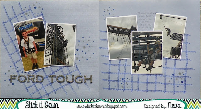
Ford Tough for Stick It Down Double Page

We have a great double page sketch for the month of November at Stick It Down, it can be very seasonal like the sketch or altered to fit your theme like I did!


Here is my version that captures an exhilarating event for my son from last summer's trip to EAA Airventure in Oshkosh Wisconsin.


I wanted to represent the ropes for the embellishments behind the photos, and the easiest way to do that was to stamp a design using Technique Tuesday's Borderline Industry stamps and Delicata Mediterranean Blue ink by Tsukineko.  Since I was going with a bit more of a grunge look I dug out some really old pens that Zig made about 20 years ago called Dotta Riffic, you can make different size dots depending on how hard you push on the flexible rubber tip.  The photos seemed to blend into the background cardstock, so I backed them with white cardstock and barely inked the edges of the cardstock.  The finishing touch was the Recollections stickers in masculine font that were an industrial silver finish.  A fairly clean and simple version of this easy to use sketch. 

FYI, the Ford reference is because Ford Motor Company is a huge sponsor of EAA AirVenture and has a ginormous display and activity area right off the main drag at the show.  This is the first year that my son tried the big ropes course.  I am glad I have a layout for his scrapbook of this endeavor!

Thanks for stopping by! 

Monday, October 1, 2018

Stick It Down Double Page Halloween Version

We have a fantastic sketch for you this month at Stick It Down.   Check out what the design team did with this fun sketch and notice that we are collaborating with the White with One challenge, which features Grey as the plus one color.


You will notice that I mirrored the sketch and replaced the two smaller photos with one 4" x 6" photo.  This fit the sequence of my photos much better!


As the White + One challenges suggests 70% white, I did choose to use white as my background.  Two different designs of Grey patterned paper, Core'dinations Grey plaid and Darice Grey Small Dot, complete the main elements of the sketch.  The photos are actually trimmed to 3 3/4" x 5 3/4" so that one sheet of Bazzill Ash was used to back the phots.  The scrap of Bazzill Ash is die cut with Quickutz Abigail to create the title.  This font is great when you are short on space but still want to make large title.  The bats are die cut from black cardstock with Echo Park's Going Batty die.  The eyes are colored in with a white Gelly Roll pen.  The spider web washi tape is from Paper Studio and was a killer deal over at Hobby Lobby last month.  (A box with 50 different washi tapes that cover the four seasons of the year on clearance for $7.50!)  To add the last element of the sketch I stamped spider webs in Memento Tuxedo Black.  The stamp comes from a really old Halloween set by Heidi Grace Designs.  A fairly clean and simple design that came together quickly!

Please do stop by and check out the double page, single page, and card sketches for this month over at Stick It Down.  Lots of fun to be had!  Play along with White With One as well.

Thanks for stopping by and taking a peak!