Tuesday, October 3, 2017

Welcome Autumn Wooden Sign


“What wood you do?” is our challenge for the month at Imagine and my project is featured today!  I choose to create a new wooden sign to celebrate the coming of autumn.  In the process, I discovered that All Purpose Ink is a great stain for a porous wood surface.  A leaf stencil supplies the design, a fun tall and skinny alphabet stamp and StazOn ink makes quick work of a darling home décor sign. For what it is worth, remember that two-sided signs allow you to have a practice run at color choices and placement of images; when it is hanging by your door no one will be the wiser!   With a few supplies you can try your hand at creating a something new for your home. 

Level:  Beginner
Time:  30 minutes 

Step 1
Place stencil over wood sign and ink with All Purpose ink.  Place ink blusher over opening and gently tip bottle to add ink to the ink blusher.  Apply the API through the stencil.  I always start with the lightest color first, in this case Lemon Yellow.

 
Step 2 
Apply different colors like Tangerine through the stencil.  The API will still be slightly wet and will blend nicely.  The project can be set aside to dry or the process can be sped up with a heat tool.


Step 3
Move stencil and add additional colors to the scheme like Red Delicious.


Step 4
As you continue to move the stencil and ink more leaves you can use ink that is on the stencil to create new blends of fall colors.


Step 5
Determine placement and stamp sentiment with StazOn ink, I used Blazing Red.  Set aside to dry.  


Step 6
Not being satisfied I decided a bit of color around the edges would finish off the rustic look of the sign, Autumn Leaf API was the perfect choice.

Now I have a new sign to hang at my front door for the autumn season!

Imagine

Other
Plaid—Leaf Stencil
Art Warehouse—Tall and Skinny Alpha
Sierra Pacific Crafts wood sign


Sunday, October 1, 2017

Aubergine Imagine's color of the month


Aubergine is such a rich fall color, and many things in nature sport this amazing hue.  Imagine is featuring three lovely cards that focus on the use of this color, go check them out!  Lotus flowers come in many versions, and one is the lovely color of aubergine.  Using a layered stamp made quick work of creating a few charming flowers to decorate a pretty card.  A bit of Electric Yellow Amplify! adds the stamen texture to the lotus flower.  The basket weave background matches the leaves perfectly as the same Memento ink was applied to the embossing folder as was used to stamp the leaf images.  Blending two colors Versa Magic ink creates a realistic color for the water of the pond, which reminded me of the photo that inspired this classic card.   To carry the color theme throughout the card, a backing layer is inked with an ink blusher and matching Elderberry Memento ink.  The sentiment is also stamped in the vivid Aubergine color to complete the look.

Imagine

Other
Altenew—Lotus stamp set and matching die set
Joy Clair—Hello Sentimental stamp set
Cuttlebug—Basket weave embossing folder

Tuesday, September 26, 2017

Travel On! for Retro Rubber, Adventure Is Out There

What a fun theme for our family right now, Travel On!   Retro Rubber has some really fun transportation themed cards showcased, go check them out.


I have 3 nieces and they are spread around the world: one in Alaska, one in St. Croix (she was fine with Hurricane Jose, but not is struggling to secure a way off the island after Hurricane Maria), and one on semester long collegiate exchange in Oslo, Norway.   I think this card will head to Norway to cheer up the college student.  I pray that the niece still in St Croix will be on her way home soon.  The airport is demolished and she is trying to get passage on a Mercy Ship.  It may be a long process to get her and her fiance home!


I started with a Darice Embossing folder, the World Map.  The debossed area is the water, so I decided to ink the folder up with a brayer and Memento Danube Blue ink.  I cleaned up some of the areas with a cotton swab to remove ink that shouldn’t be there before pressure embossing white cardstock.  (I learned this little tip from the first trial of the card front!)  Next I trimmed the cardstock to adhere to a card base.  The hot air balloon is from Carta Bella Adventure is Out There stamp and die set released just over a year ago in 2016.  Using a stamp positioner the entire image is first inked with Memento Cantaloupe and stamped.  Memento Morocco is inked in the top of the balloon and stamped.  Memento Toffee Crunch inks up the basket area.  The final ink added is Versa Mark Dazzle that allows the entire image to be heat embossed with clear embossing powder.  After the image is die cut, details are added with irRESISTible Pico Embellisher in Tangelo.  The sentiment is stamped in Memento Morocco and Versa Mark Dazzle and heat embossed with clear embossing powder.  The outside edges were inked with Memento Morocco.  The images are adhered with dimensional foam adhesive. 

Do stop by and play along with this fun theme at Retro Rubber!  Remember to use a stamp that is at least one year or older, and to enter up to 10 challenges including ours.  Have fun creating!


Monday, September 25, 2017

Published in Fall Stampers' Sampler!

Wahoo!  Last December I took part in the Season's Giving Blog Hop.  I made a crafting goal of submitting projects to print magazines for publication.  I took a few submissions to achieve this goal, but here it is!


My card is located on page 84 and features a stamp and die set from Sizzix designed by Stephanie Bernard.  All of the inks and sprays are by Imagine, the American division of Tsukineko.


 Here is the front cover of the issue.  So exciting to met this goal, and plan on doing a submitting for consideration of publication in the future as well!


Finally, here are the photos I took of my card before I sent it in.  As you can see, the easel opens up to display the message and really helps the turkey stand up!

Thanks for stopping by and sharing my few moments of publishing fun!

Thursday, September 21, 2017

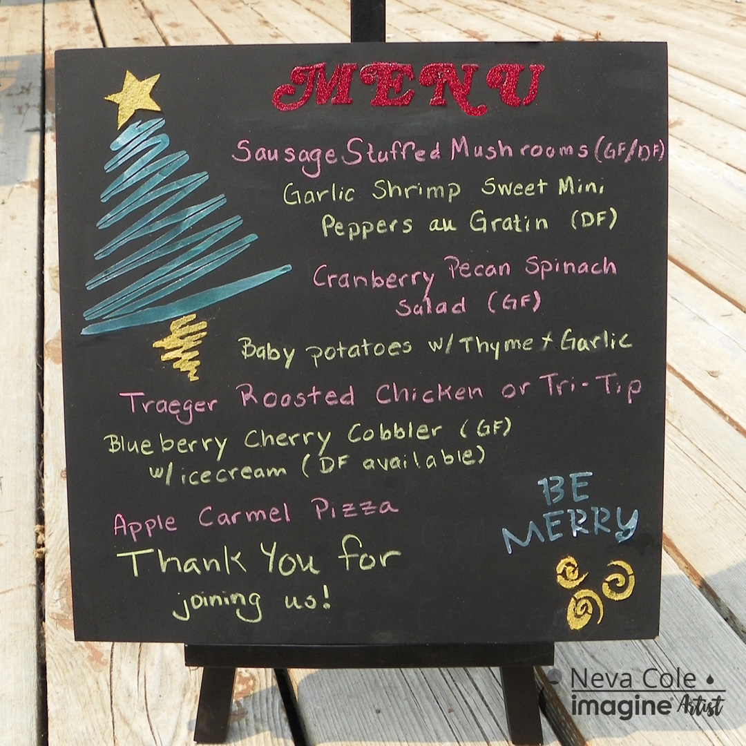
Christmas planning, and fun Blackboard Menu


Featured at Imagine today is my Christmas planning project.  Blackboard menus are popular at many eating establishments, so I decided to make one of my own for Christmas parties that I hold in my home during the holiday season. I host at least one party every year, and may even get in on the neighborhood progressive dinner this year! Creative Medium, a little glitter and two stencils quickly made this menu board very festive! The Creative Medium will hold fine particle embellishments like glitter or beads. The Iridescent Green Creative Medium shows up fabulously on the black background, and the Gold Creative Medium adds a touch of metallic elegance. The menu is written in colored Crayola chalk that was sharpened with a child’s large pencil sharpener.  This fun and easy project is a great way to enhance any party! Enjoy and thank you for stopping by

Imagine

Other
Sierra Pacific Crafts 12” x 12” Chalkboard Tile
Stencil Girl—Three Trees
C-Thru Stencils—3/4” Swash Bold Italic alpha stencil
Art Institute Ultra Fine—Christmas Red glitter
Crayola Chalk
Pencil sharpener for large pencils

Friday, September 15, 2017

Change the World using Rose Gold


Personally, I really like Rose Gold, my iPhone just happens to be this color!  The color challenge at Imagine for the month of September was to create something with Rose Gold.  It was fun to create a card that features this fabulous color.  To highlight the Rose Gold color, the card is a clean and simple design.  The images are stamped in Delicata Rose Gold and Black Shimmer first to help determine the placement of the line of pressure embossed dots.  The dots were inked using a Fantastix Brush point and the Delicata Rose Gold ink.  The base card is inked with crumpled aluminum foil and Delicata Rose Gold.  The top panel is adhered and the simple but sophisticated card is ready to be sent to a friend!

Imagine

Other
Cream cardstock
Unity—Love Brings You Home stamp set
Cuttlebug—Daisy Borders embossing folder
Aluminum foil
Corner rounder


Wednesday, September 13, 2017

Create your own Total Eclipse background!


Featured on the Imagine Blog today!

I will admit, the Great American Eclipse truly lived up to all the hype and expectations.  We are fortunate to live VERY close to the zone of totality and were able to enjoy an experience of a lifetime!  There were many amazing photos taken on this date, and I was able to take a few myself.  I am surprised that my totality photo of the corona resembles the others taken across the United States.  Knowing I would create a layout to commemorate the event I planned ahead and had everyone present sign on a section of white cardstock.  Totality was so stunning I wanted to create the same look and feel of nature and the new Delicata Ink colors were absolutely perfect!  The shimmer is wonderful in person, but a bit difficult to capture in photos.  The surroundings during totality were are bit surreal, and the Delicata inks captured the feeling effortlessly.  This is a super easy background to create for your own eclipse photos, so get a little inky before you scrapbook your total eclipse layout!

Level:  Beginner
Time:  30 minutes to create background plus dry time


Step 1:
Trim Strathmore Bristol Board 100-pound weight from 14” x 17” to 12” x 12”.  Bristol Board is absolutely the best for this technique as it will stand up to Ink Potion No. 9 mists and repeated blending of the inks with Jumbo Daubers.  The smooth surface will take the ink readily.  Remove the spray applicator from the Goose Bumps bottle and gently tap the clear texture medium over the top half of the Bristol Board.  Set aside to dry.


Step 2:
Mist the bottom section of the paper and gently move Ink Point No. 9 around the entire area with your fingers.  Apply Delicata in Champagne with a Jumbo Dauber. 

 
Step 3:
Repeat with Ink Potion No. 9 and Delicata in Pink Shimmer.  It is starting to look like a sunrise!


Step 4:
Mist the top portion of the paper and ink with Deleicata in Sapphire Blue.  If one area is a bit darker than desired, add a bit of Ink Potion No. 9 to the craft mat and pick up with the Jumbo Dauber.  The smooth surface of the Bristol Board is very forgiving and allows the inks to blend beautifully.  Notice that the GooseBumps will now resemble the stars that were visible during totality!

Step 5:
Determine placement of journal block and blend Delicata inks accordingly on section of Bristol Board that was trimmed off the original sized sheet.  Print journaling directly on the Bristol Board.  For my layout with the signatures I gently blended the inks over the signatures.  We used a permanent pen so the ink did not bleed.  Ink the edges with Delicata in Black Shimmer.


Step 6:
Ink a section of black cardstock with Delicata Black Shimmer, this will give just a hint of shimmer to match the rest of the layout.  Die cut the title and adhere.

Step 7:
Adhere your selected eclipse photos and sit back and admire and remember this event of a lifetime!

Imagine:


Other:
Strathmore Bristol Board 100 pound weight 14” x 17”
NASA Eclipse glasses
Quicktuz—Indigo alphabet (retired)