Tuesday, March 24, 2020

Magic Picture Changer card for Retro Rubber Challenge

We have a super fun challenge that you can use to create Easter cards, or just about any season for Retro Rubber.  One of our DT is in the Southern Hemisphere and she used this challenge to create a fall card.   Do stop by to see all of the wonderful projects.


I ended up using two diagonals: eggs, die cut, pattern paper AND Easter, die cut, baby animals.  One of my favorite things is to create interactive cards, and have been doing it for years, even before cool dies and online instructions are around.  However this time the process went much quicker with the use of a set of Lawn Fawn dies called Magic Picture Changer.  This is the closed position:


I followed the directions from the Lawn Fawn assembly video
  • All my images are from the Chirpy Chirp Chirp set (2/2016) and are stamped in Memento Tuxedo Black then colored with Chameleon pens.  
  • To layer the images they were first stamped on Post-It notes and fussy cut to create mini masks.
  • I used Chameleon NU4 Caramel, YO2 Mellow Yellow, OR4 Seville Orange, PK3 Bubble Gum, and WG3 Warm Gray.   (One of my goals during the social distancing time is to actually sit down and go through the instructions videos about color with Chameleons so I can become a better colorist!)
  • The  grass which is peaking through the frame is Memento Pear Tart.
  • With the masks still in place the sky is sponged in with an Ink Dauber and Memento Summer Sky.
  • The pattern paper is from a very old set of Provocraft papers that I've had for 20 years!  Still have a selection and am glad to see them make an appearance in my crafting.  

This is the card in the open position.  What shows up during the transition is the word: Translation: happy easter.

I hope you enjoyed this project and it will be in an envelop soon for Easter.  Please do play along and join our fun little challenge at Retro Rubber.  We have a few simple rules.  1)  Use a stamp that is older than one year.  2)  Tell us how old the stamp is in your description.  3)  Enter ONLY up to 10 challenges including ours.  

Thursday, March 12, 2020

NW Duals

Wrestling is a sport that I have thousands of photos . . . when the boys were younger I could distill a season down into a layout or two.  For John's senior season I decided to scrap each event in it's own layout.  Even with that I must select down to a few photos of some very intense minutes. 


Mountain View colors are red and black, so an easy choice to stay in that color scheme.  I ordered a batch of Darice papers as I knew with three kids to go through Mountain View I would use them frequently for sports and school events.  
  • Each photo is backed with Bazzill red cardstock and the background is Bazzill black cardstock. 
  • Three patterns of Darice papers are used:  Large Black Dots, Red Plaid, and Red Stripe
  • Since I wanted to layer the patterned papers a frame of grey cardstock helped define and separate the two. 
  • The red stripe is punched with the Paper Studio Pennant punch.
  • Paper Studio Wrestling stickers are backed with the grey cardstock and fussy cut.  They blended into the background too much otherwise.  
  • The title font is Recollections, and stood out much better on the red plaid than on the black back ground.  
  • Journaling was also printed out on the grey cardstock.  
I am happy to have another layout completed.  Sometimes not doing all the wrestling layouts at the same time helps my creativity.  Thanks for stopping by, and know that your comments are always appreciated!  

Wednesday, March 11, 2020

No River Required

I often create layouts in duplicate or triplicate for my kids' albums.  This was the case for this layout, three kids with memories to preserve, so three layouts. 


I found several patterned papers I wanted to use that were great colors for the photos, but I only had one sheet of each.  So the challenge was to create a layout that would use one third each.  I think I accomplished my goal! 

Several years ago I purged all my printed magazines as they were taking up room on my shelves and not being used.  Before I did that though, I salvaged articles and ideas for layouts that appealed to me.  This layout is based on an article from Creating Keepsakes Nov/Dec 2010, about using scraps. 

  • My Minds Eye Lime Twirl collection stripes and darker blue patterned paper, and Creative Imaginations Blue Scroll were used.  Bottom rectangles are 2" x 3".  
  • Top strip is 1" backed by 1 1/2" white cardstock.
  • Four punches were used to created the different size circle.  The punches are fast, compared to die cutting!  EK Succes, Fiskars, Marvy and McGill are all represented.
  • Bazzill green is the background, Darice Persimmon is the orange.
  • The journal strips are inked in Memento Danube Blue and written in Zig Writer Navy.  
  • The title was cut on my Brother Scan N Cut.  
A bit time consuming to create three of the same, but I am very pleased with the results.  Thanks so much for you comments and time to stop by!

Tuesday, March 10, 2020

YOU for Retro Rubber Challenge Blog

The next two weeks we have a great CAS sketch over at Retro Rubber.  Please do come and play along with our challenge, and check out the wonderful cards the Design Team created as well.  We do have several simple rules:  1)  Use at least one stamp that is older than one year and needs some inky love.  2)  Let us know about how old the stamp is  3)  Enter up to ten challenges including ours.


My card took all of 15 minutes, once I decided on the papers and stamps.  I rotated the sketch as the sayings I wanted to put on the card would not fit the other direction!

  • Hot Off The Press has a great set called YOU, the die is die cut from Basic Grey's Granola.  This is a very retro paper from about 2008.  Three more die cuts are made to stack and add dimension.
  • Three sentiments from the You Greetings are stamped in Powder Puff Chalking Ink in Cool Grey.  Each sentiment is trimmed and the edges are inked.  
  • Another selection from the Granola collection is adhered to the front of the card.  
  • The YOU die cut and the sentiments are added with dimension foam adhesive. 
There you have it!  A great masculine card to send to my son.  Please do come by Retro Rubber Challenge Blog and check out this fun sketch challenge.  Thank you so much for stopping by and I enjoy reading all your comments.  

Monday, March 9, 2020

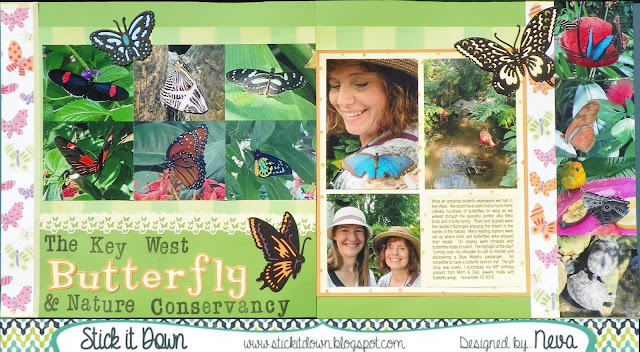
Butterflies for SID March Double Page Reveal

Even though my photos were taken last fall (in Florida) they are perfect for a spring green layout.  We have several fun sketches for you over at Stick It Down.  Not only a double page, but also a single page, and card sketch to play along with for the month.  Check it out!


For my layout I choose to add more photos, by making them smaller.  There are too many wonderful things to share from this experience at The Key West Butterfly and Nature Conservancy.  (At least I had the long title!)


I tried several different colors of background cardstock before I finally decided on the green.  With the bright colors of the butterflies and fun patterned paper I think it holds the layout together.
  • A very old collection by Me & My Big Ideas by Ellen Krans (2006) had all the selections of coordinated paper to make it easy to put together.  
  • Paper Studio light yellow washi adds a dash of pastel to the eges of the butterfly paper.
  • I love butterflies, and sometimes (well often!) will buy a stamp or die just because it is a butterfly.  The Cuttlebug Anna Griffin Butterfly Trio was just such a purchase.  Look how wonderful they are as embellishments for this layout.  If you look closely some of the highlights are colored through the die with Writer Chalk Collection markers.  I also backed each butterfly with a matching die cut by scanning on my Brother Scan N Cut and die cutting coordinating cardstock to put behind the butterflies.
  • Another butterfly tool in my stash is the Tonic Butterfly border punch.  I just had to use it in this layout as an add on embellishment.  The top edge is punched with EK Bubble edge border punch.   
  • The title is a combination of Stampabilities Vintage Type alpha stamped in Tuxedo Black Memento Luxe and Quickutz Tangerine & Shadow.
  • The yellow and orange dot patterned paper is backed with orange cardstock, and the journaling is printed on yellow cardstock that is the exact color of the patterned paper.
Do come and check out the blog and give one of our sketches at Stick It Down a try.  It will be fun!

Thanks for stopping by your comments always make me smile!